2017 Winner
Printed By Somerset
Printed By Somerset
Gold Design AOY: Leo Burnett
The Challenge
In the digital age, how could an agency help grow a small printing business with a niche clientele?
Somerset is a small printing shop in Mississauga that had become lumped in with every other printer. It was seen as just another dinosaur in the age of digital, fighting to get more than its fair share of disposable printed pieces like flyers and brochures.
With the advertising community focused on digital innovation, no one was aware of Somerset’s true and still relevant point of difference – its ability to execute beautiful, high-quality printed pieces.
Faced with a niche target and zero dollars for media, agency Leo Burnett needed to put Somerset on the map with a re-brand, and a unique approach to its “digital” presence and direct communications that would let the audience experience the quality for themselves.
Insight
People can’t evaluate the quality of printing through a screen.
The high-quality, bespoke products and services Somerset was capable of providing were not what their existing client base of “brochures by the thousand” was looking to create. Somerset was thirsty to grow their client base to include those who were interested in their high-quality, specialized offering, the consumer base that understood the value that printed techniques and stocks could bring to a project – the creative community.
If Somerset was going to be known for high-quality printing and attract the clients that wanted such printing, then every method of communication with the desired target had to be in the form of high-quality printing.
The Plan
Create a website by designers, for designers. And bring it to life the only way Somerset knows how: by printing it.
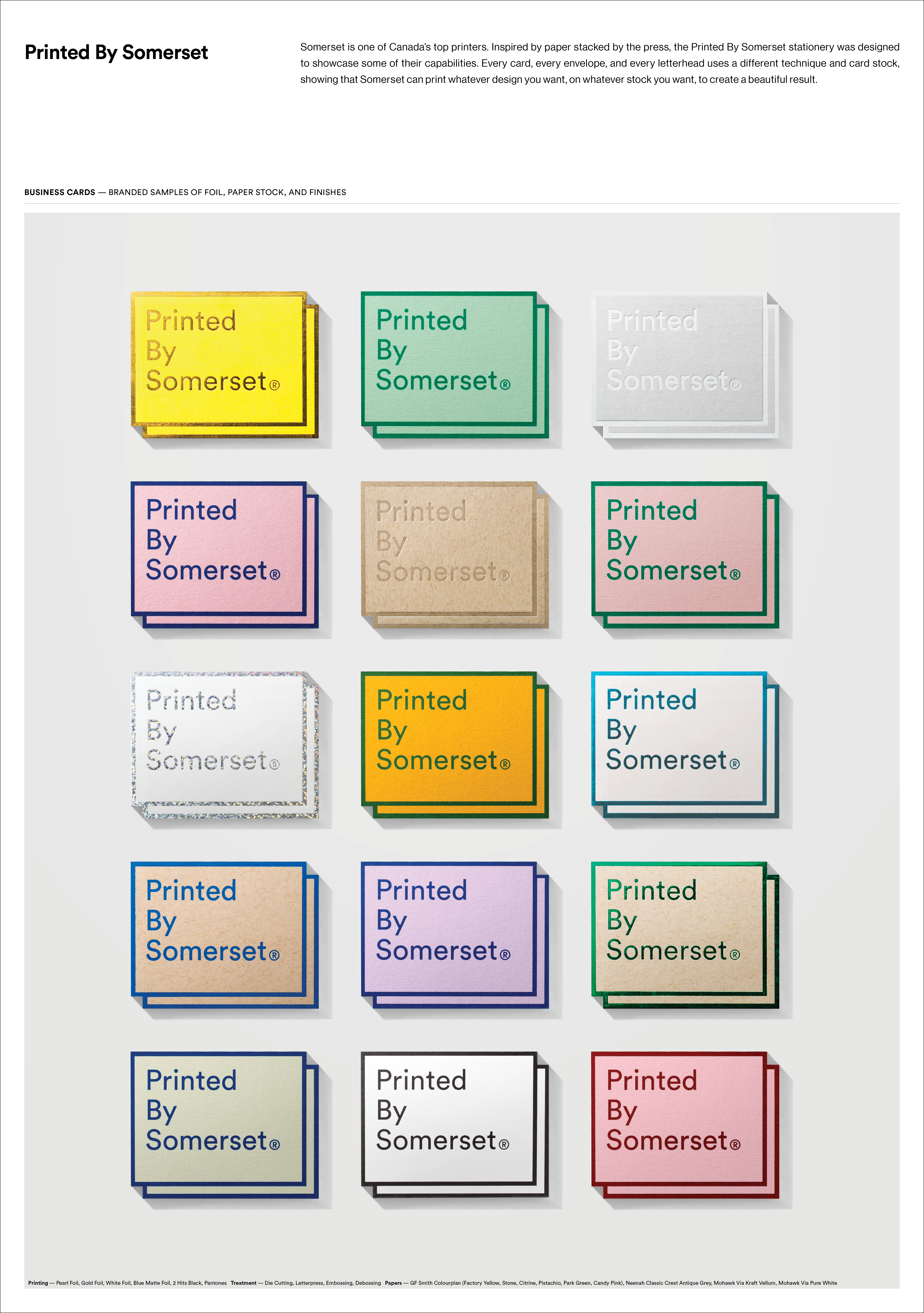
The agency began by renaming “Somerset” to “Printed by Somerset.” This gave the business immediate ownership of quality and displayed the pride in their work on every printed piece. The team then created a diverse visual identity, inspired by stacks of paper on the press floor, by using every printed technique, stock, foil, ink, texture and finish Somerset had to offer.
From there the team developed a full collateral package including business cards, envelopes, stationery, sticky-pads and notebooks in unique combinations of printing techniques designed with the various types of design-led businesses and potential clientele in mind. We developed a version for the fashion community, a version for the architectural community and a version for the advertising community, and so on. The collateral in itself was a reflection of the breadth of capabilities and print offerings and was designed with the clientele they wanted to attract in mind. The combination was a direct representation of the attention to detail and quality only Somerset could provide.
Everything was built on a grid with extreme attention to detail and precision. Every printed piece was an opportunity to delight designers. Each piece became a reference for a unique print feature or treatment, a keepsake for designers that would keep Somerset on their desks when it came to choosing a printer for their next job.
For the website, the team created a printed one – the only way Somerset knew how. Rather than optimizing user-experience, animation and a fancy gallery of past work, the team approached the website like Somerset would any project – by focusing on the craftsmanship, the physicality and the details, creating a tactile, true-to-print website that you could see and interact with on the web. The site used more than 40 printing techniques on a single press sheet, including embossing, foils, scanimation, perforation and stock variety. It was shot in stop motion and transferred to the digital world. The many unique facets of the printed medium were faithfully recreated online, leading to a more accurate digital demonstration of a “Printed by Somerset” piece.
The Results
Designers talking to designers about “the most creative website ever.”
The rebrand shifted the way designers viewed Somerset. They were immediately recognized for their innovation, design capability, printing capabilities and unique offering.
“Printed by Somerset” got the industry talking – sparking a conversation on Reddit labeled “most creative website ever,” and got the attention of the creative community on a global scale through recognition at award shows that included:
Cannes Festival of Creativity – Silver for Digital & Interactive Design, Bronze for Website
London International Advertising Awards – Gold in Direct Marketing B2B
Epica Awards – Gold for Brand Identity, Gold for Website
D&AD – Yellow Pencil for Graphic Design: Direct Mail
One Show – Bronze for Design Innovation, Bronze for Interactive Craft
ADCC – Six Golds, One Silver


