2017 Winner
Olympic
Ultima Foods
Bronze Design AOY: lg2
The Purpose
Canadian dairy brand Olympic was over 30-years-old and suffering from low relevance due to an outdated image, identity and package design. A lack of a strong brand positioning was reflected in the brand’s core consumers: 55-year-old Western Canadians. This was not a segment that could be counted on to generate national growth.
Packaging is the driving force of Olympic’s image, so agency Lg2 needed to ensure it played a major role in achieving Olympic’s business objectives: secure listings and generate growth.
The Challenge
How could Olympic – a small dairy brand from a tiny, out-of-the-way area of British Columbia on the west coast of Canada – become a leading Canadian brand? How could it compete against giants like Danone, Yoplait, Astro and Liberté?
Olympic needed to refresh its outdated image and position itself as a premium brand in order to connect with a younger set of consumers and penetrate key Canadian markets. It would all start with its image on the shelf.
The Insight
While small, Olympic hails from Canada’s most socially conscious and nature-loving region: the west coast. Olympic’s redefined brand story, purpose and meaning clearly lay in its west coast DNA: socially conscious, strongly organic, healthy and ruggedly simple, with inspiring nature.
The Execution
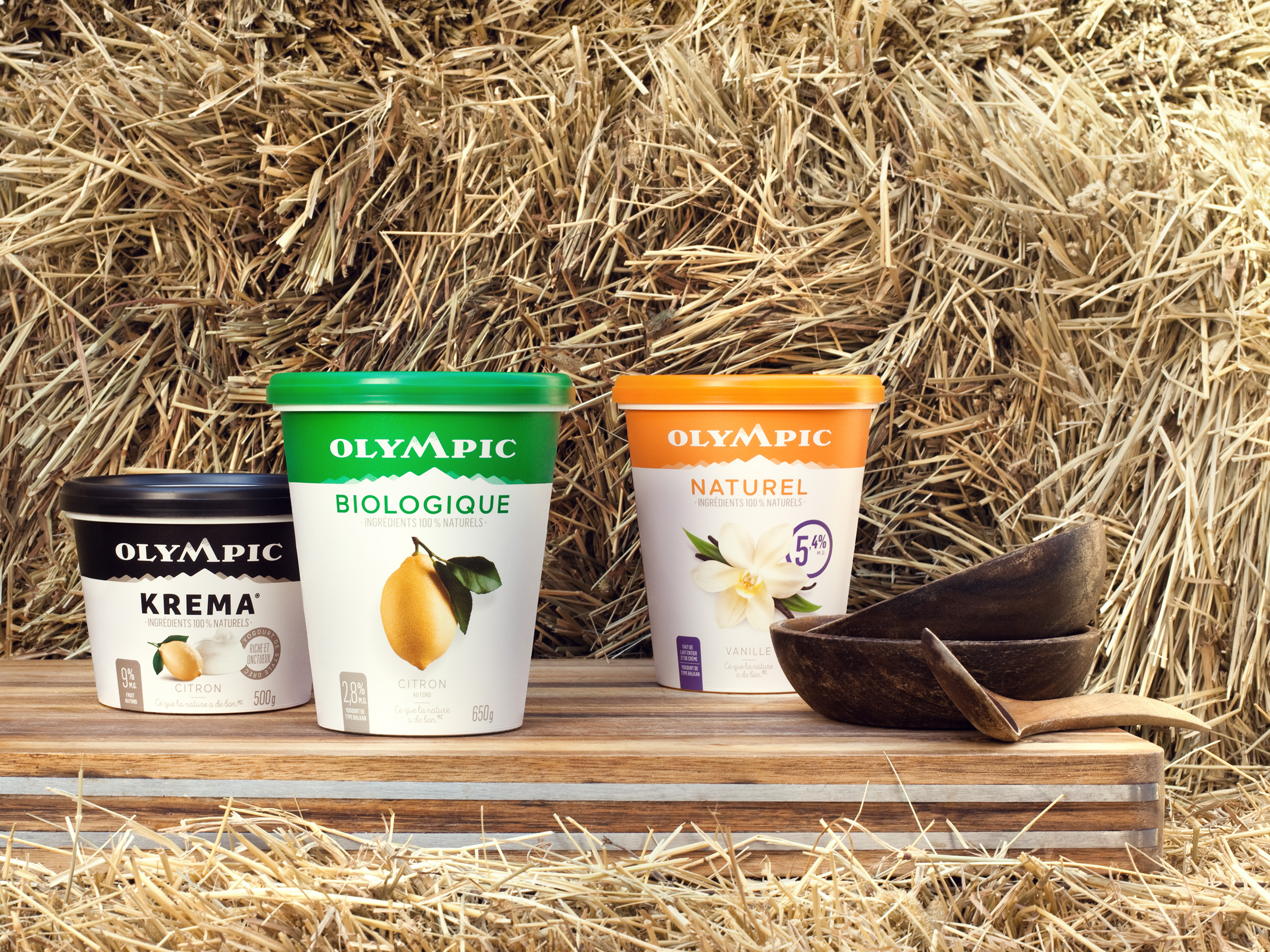
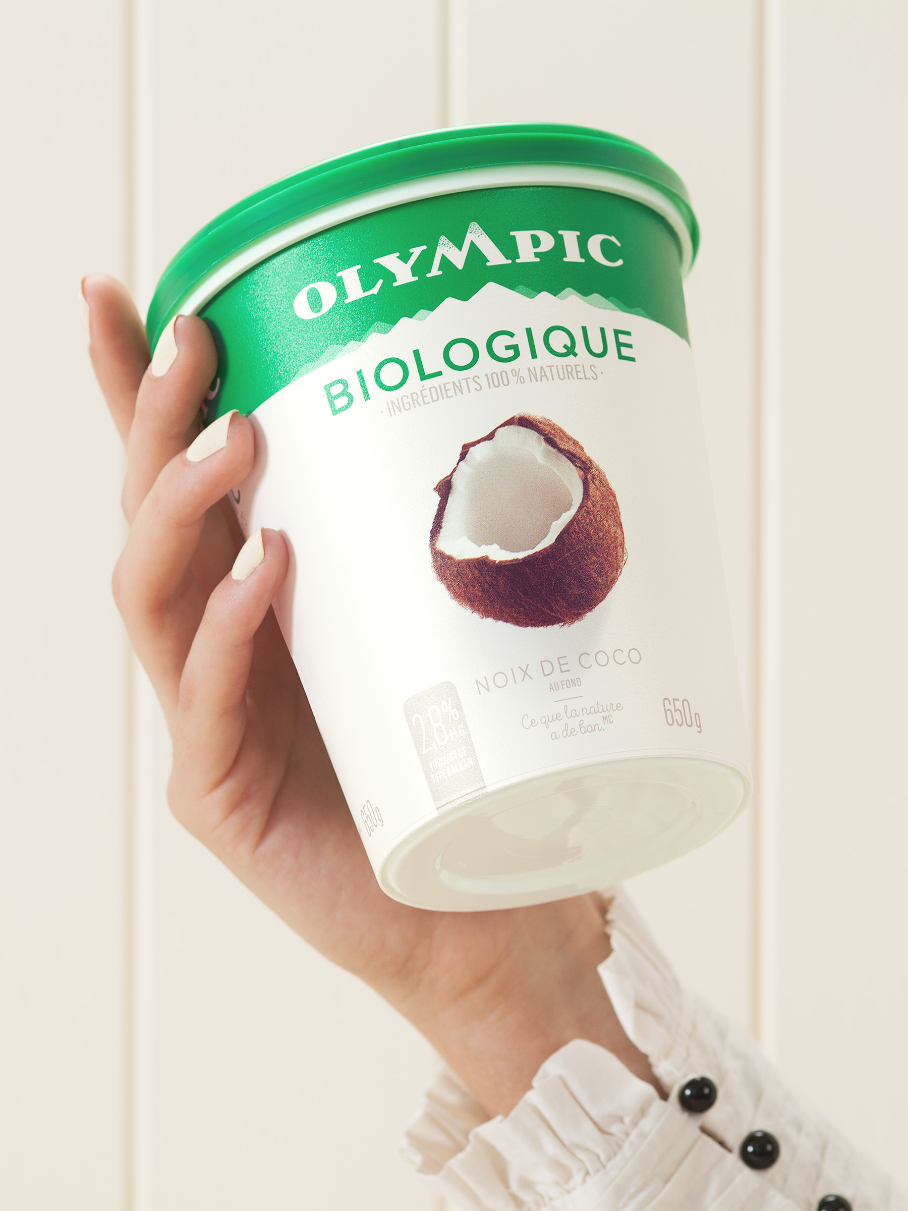
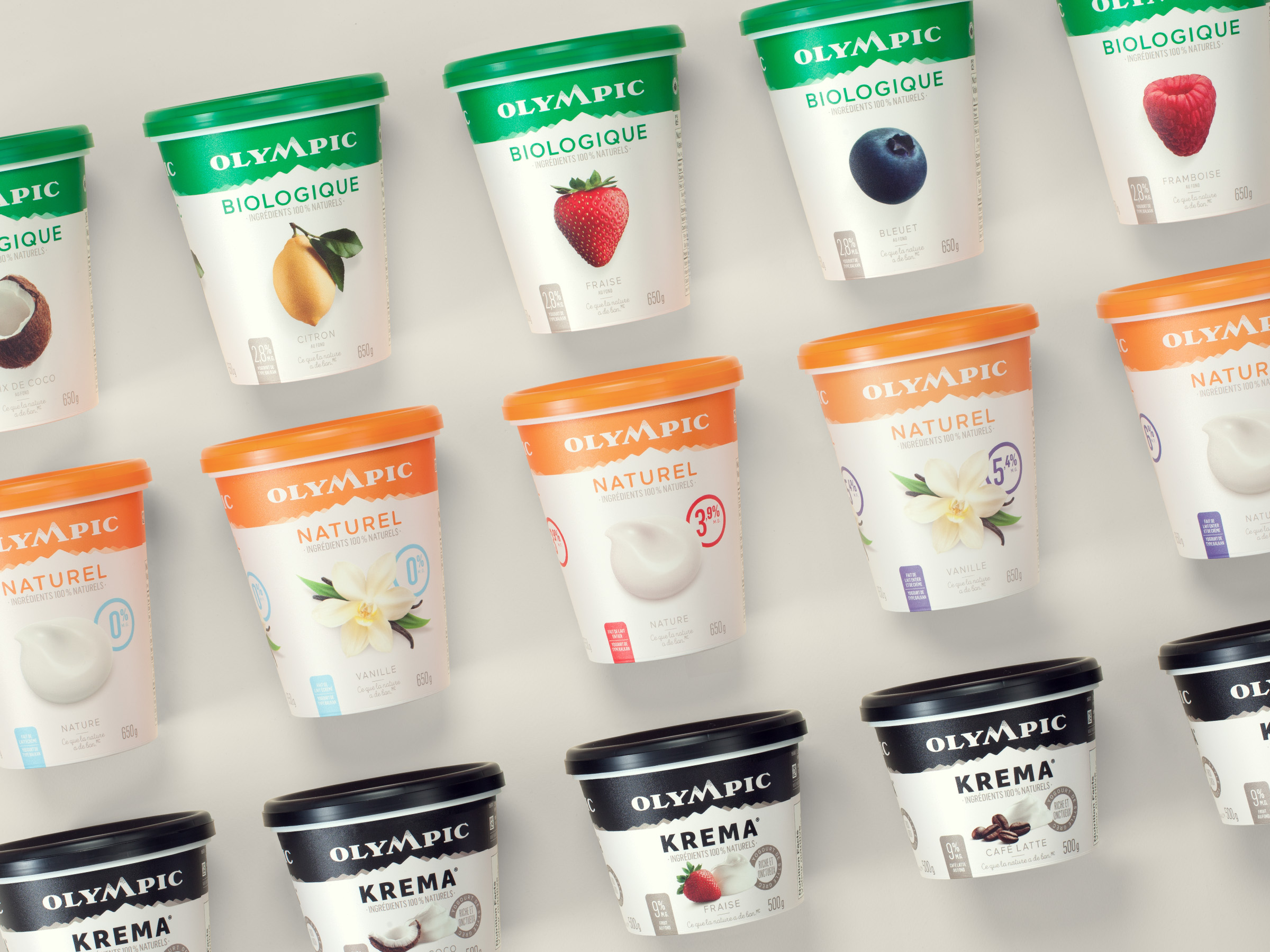
Taking from this insight, Lg2 repositioned Olympic as “Canada’s premium yogurt brand made with a west coast spirit.” The agency started by developing a new product portfolio architecture: leaner and clearer, with three main product segments – organic, indulgence and natural.
The new Olympic logo was designed to convey the feeling of rugged, unspoiled nature, with a forest green master brand colour. The new “M” in the Olympic name reflects the silhouette of a mountain, the west coast’s most iconic symbol for both locals and visitors.
The team then redesigned the packaging, with one guiding principle in mind: keep it as pure as the west coast spirit. They developed a clean and uncluttered design that reflects the origin of Olympic products. Each element is reduced to its simplest expression and each detail is thoughtfully designed to ensure the packaging reflects the nature of the contents. Repeated across all segments, the mountain chain design conveys the west coast’s majestic natural scenery while creating strong brand blocking on-shelf.
The Impact
In less than eight months (August 2016–March 2017):
-Olympic has become the fastest growing yogurt brand in Canada (L52 weeks +9%)
-It is also the fastest growing yogurt brand in every region in Canada (L12 weeks National +11%, Alberta +9%, Quebec +23%, Ontario +101%, West +6%).
-Business success is owed to new consumer acquisition (millennials), existing consumer support and more than 50 new listings across the country.