2017 Winner
Montreal’s Olympic Park celebrates 40 years of memorable moments
Olympic Park
Bronze Design AOY: lg2
The Purpose
Montreal’s Olympic Stadium is an iconic part of the city’s landscape that had faded into the background. Agency Lg2 was mandated to reignite the flame and give the building back its prestige – revitalizing its image and its facilities in order to generate more visits in time for its 40th anniversary.
The Challenge
In addition to being unloved by Montrealers, the Olympic Park – a concrete oasis – did not have a brand identity beyond the logo of the Quebec government. The challenges were many. These included developing the graphic identity of a neglected brand, starting from scratch. The identity needed to be timely and modern, and at the same time, capture the structure’s timeless spirit and reflect the retro design of the building.
The Insight
A lot goes on at the Olympic Park, but many people aren’t aware of all that it has to offer or how to take advantage of its improved facilities. The Park witnessed many iconic moments over time, but those too had been forgotten. Montrealers needed to reclaim ownership of the Park and tourists needed to discover it. The idea was to pay tribute to the stadium by referencing some of its most iconic moments over the past 40 years. Lg2’s concept had to pay homage to the official Olympic Park structure, its past and its present, in a fun and witty way. Aimed at Montreal residents and tourists, it was intended to generate interest and excitement about all that the Park has to offer.
The Execution
Four main elements brought the new graphic identity to life.
1. Advertising campaign for the 40th anniversary
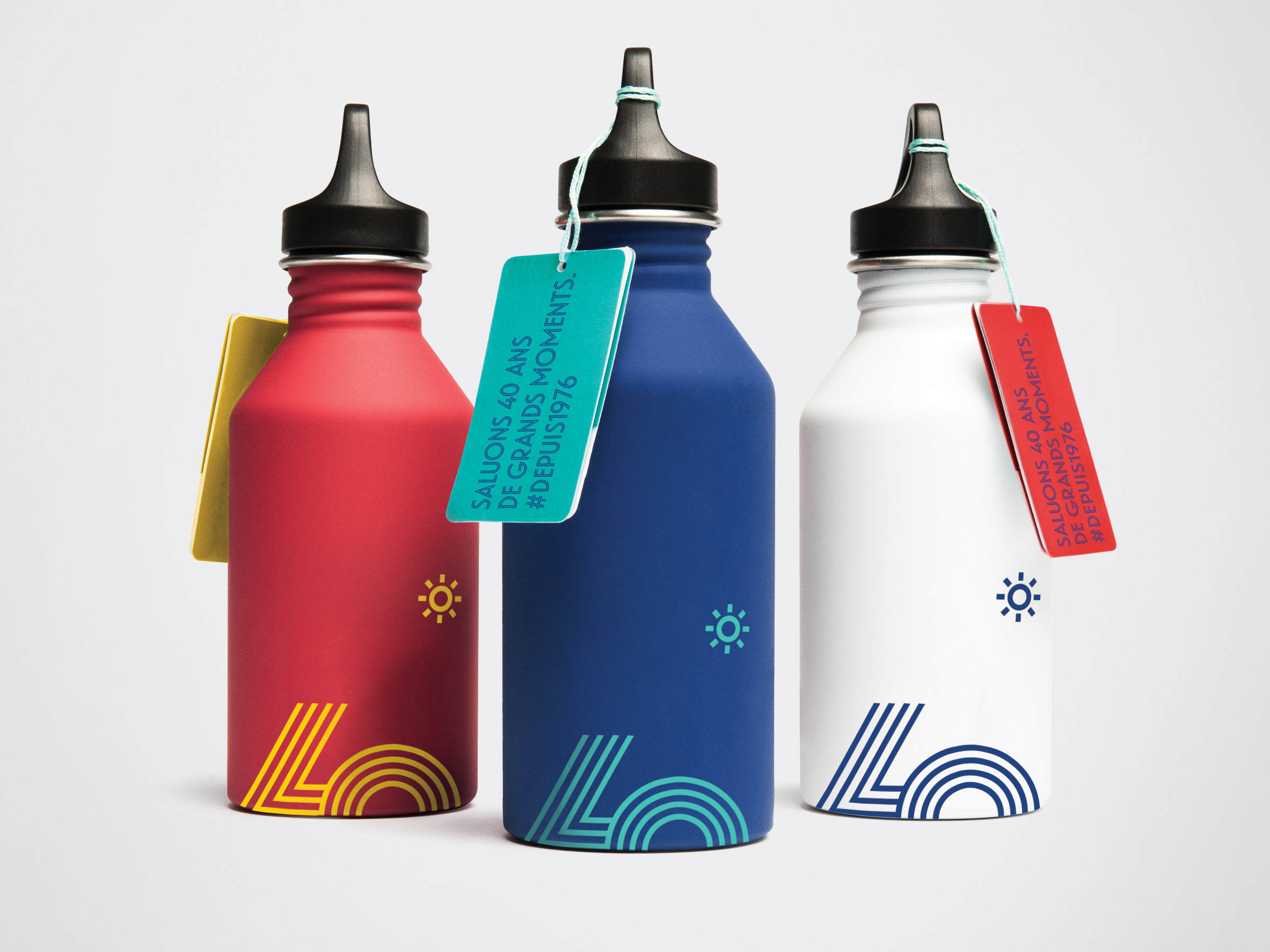
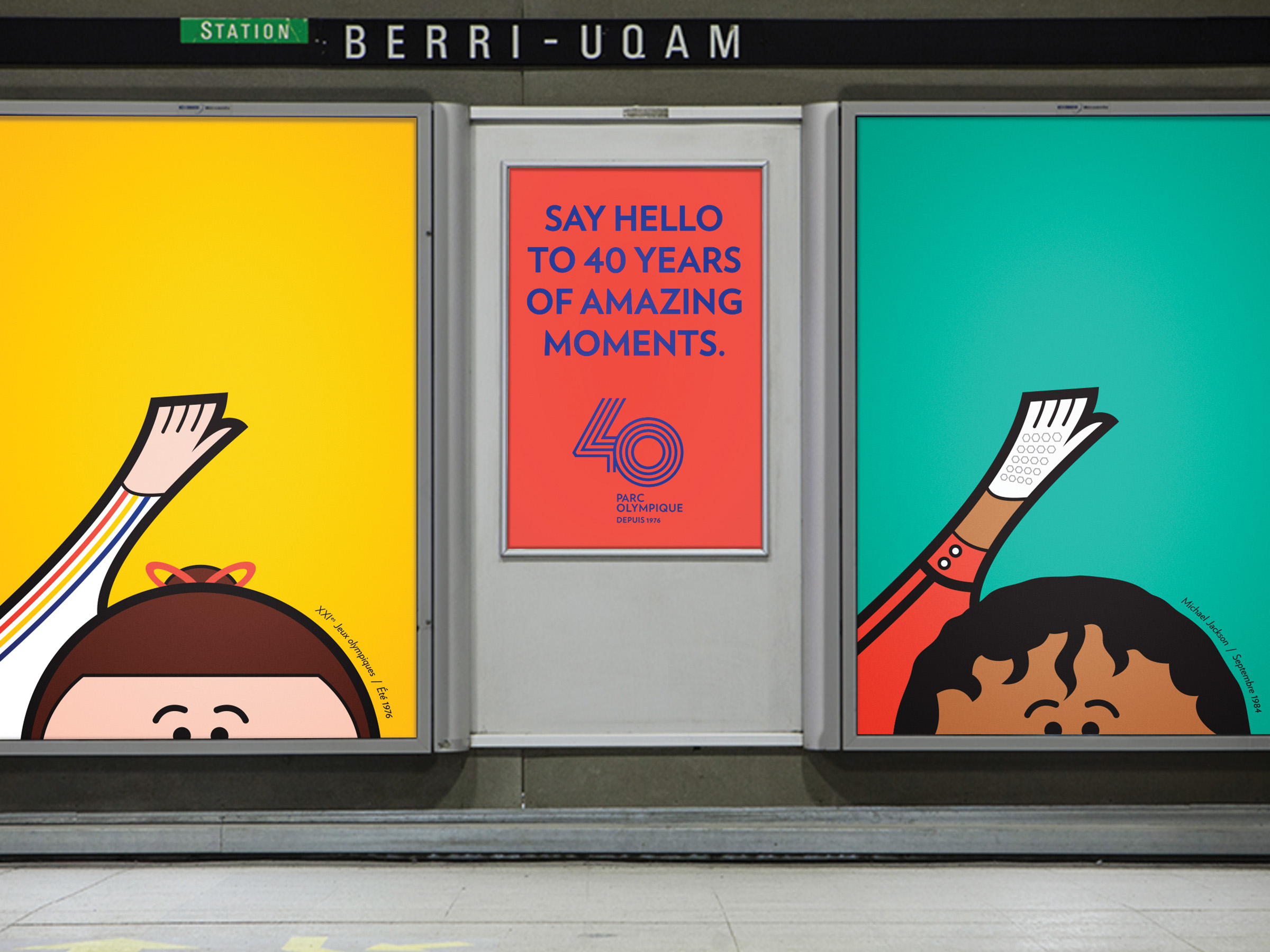
The 40th anniversary OOH campaign featured posters in bus shelters and metro stations across the Island of Montreal. The tagline, “40 Years of Amazing Memories” is reflected in the visuals that capture some of the Park’s most iconic moments. The retro ‘70s look is achieved with a colour palette that embodies the Olympic colours (red, blue, green, yellow and black) and a clean graphic style that pays a fun and authentic tribute to the monument.
2. Exhibition for the 40th anniversary
Seven themed displays were created and set up along a staged circuit that guided the visitor through a commemorative exhibition. Artifacts alone would not have been sufficient to invoke the spirit of the Games; the agency had to imagine how this mosaic of historic moments could harmoniously co-exist. In its final form, the exhibit’s design, projections and signage all worked together to act as a sort of guide.
3. Architecture
In order to bring the new brand identity to life in the building’s spaces, it is present at every point of contact. The brand image is primarily used as signage to direct visitors’ journeys and their sporting activities, while the linearity and the materials that reference the gym are meant to inspire concentration and performance.
4. Advertising campaign post-40th anniversary
To maintain momentum, an advertising campaign was launched that aimed to turn the Olympic Park into a tourist destination as well as a local destination for sports, culture and leisure. The use of symbols and universal iconography makes the brand easy to understand, without the need for text. To further build on the historical and vintage identity, the visual rendering relies on the use of artisanal materials and a handmade process.
The Impact
The Montreal Olympic Park is one of the few Olympic stadiums in the world that has been modernized and revitalized after its heyday. The campaigns and the Park's new image have created a beautiful new symbol of Montreal that does residents proud. Last year, the Olympic Park welcomed more than one million visitors, matching the record established the previous year when the Olympic Park hosted the FIFA Women’s World Cup. To welcome as many visitors without the draw of an international sporting event represents a tremendous accomplishment.