2018 Winner
Home Hardware Rebrand
Home Hardware
Bronze Design AOY: john st.
Home Hardware
Home Hardware Rebrand
The Purpose
The goal of this project was to make Home Hardware a more relevant, younger, more contemporary brand to a new generation of millennial DIYers.
The Challenge
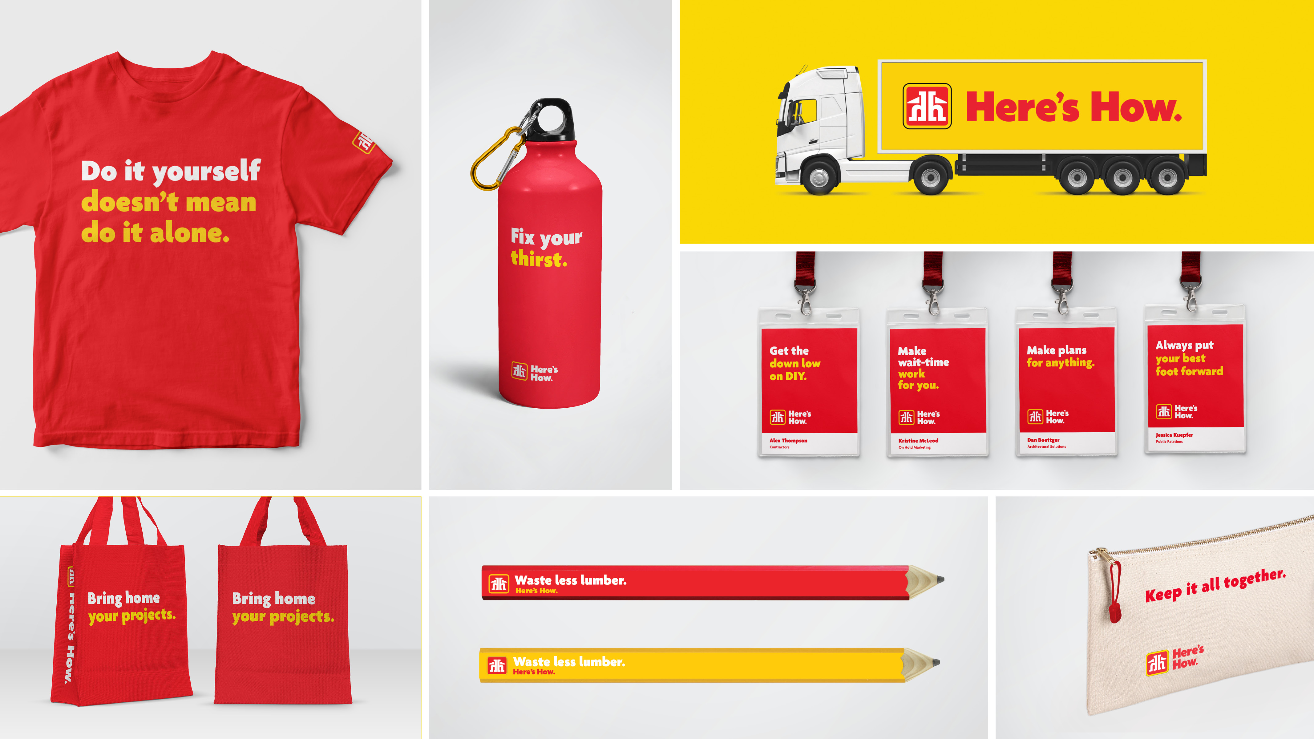
Home Hardware is a huge brand in Canada, but they were seen to be an older, overly male, and dusty brand by younger, millennial Canadians. Further, their positioning, “Home owners helping Homeowners” was irrelevant to many younger prospects who didn’t own homes, and/or were either renting or buying condos. With thousands of consumer touchpoints, this was not a problem that could be solved with a TV ad and nothing else. The brand needed to feel different everywhere - across almost 1,100 independent dealers, thousands of consumer touchpoints and four distinct store banners. Everything from delivery trucks, to annual reports, to in-store signage needed to reflect the new positioning. Home Hardware needed a simple, consistent visual language and design system that could contemporize it and bring it into the consideration set for the next generation of DIYers.
The Insight
Home Hardware has some very serious competition in Home Depot and Lowe’s. Both are massive North American companies with significantly bigger budgets, bigger store footprints, and better technology and distribution systems.
But as the agency looked at the brand, it discovered that Home Hardware had one distinct advantage over their competition: their people. Consumers saw Home Hardware as people while they saw their competitors as places. And in the world of DIY, people matter as almost everyone needs someone to talk to about their project – be it a massive kitchen reno or trying to find the right grass seed for your lawn. Home Hardware employees were seen to be knowledgeable, approachable, helpful people who could show you what you need and how to use it.
The Execution
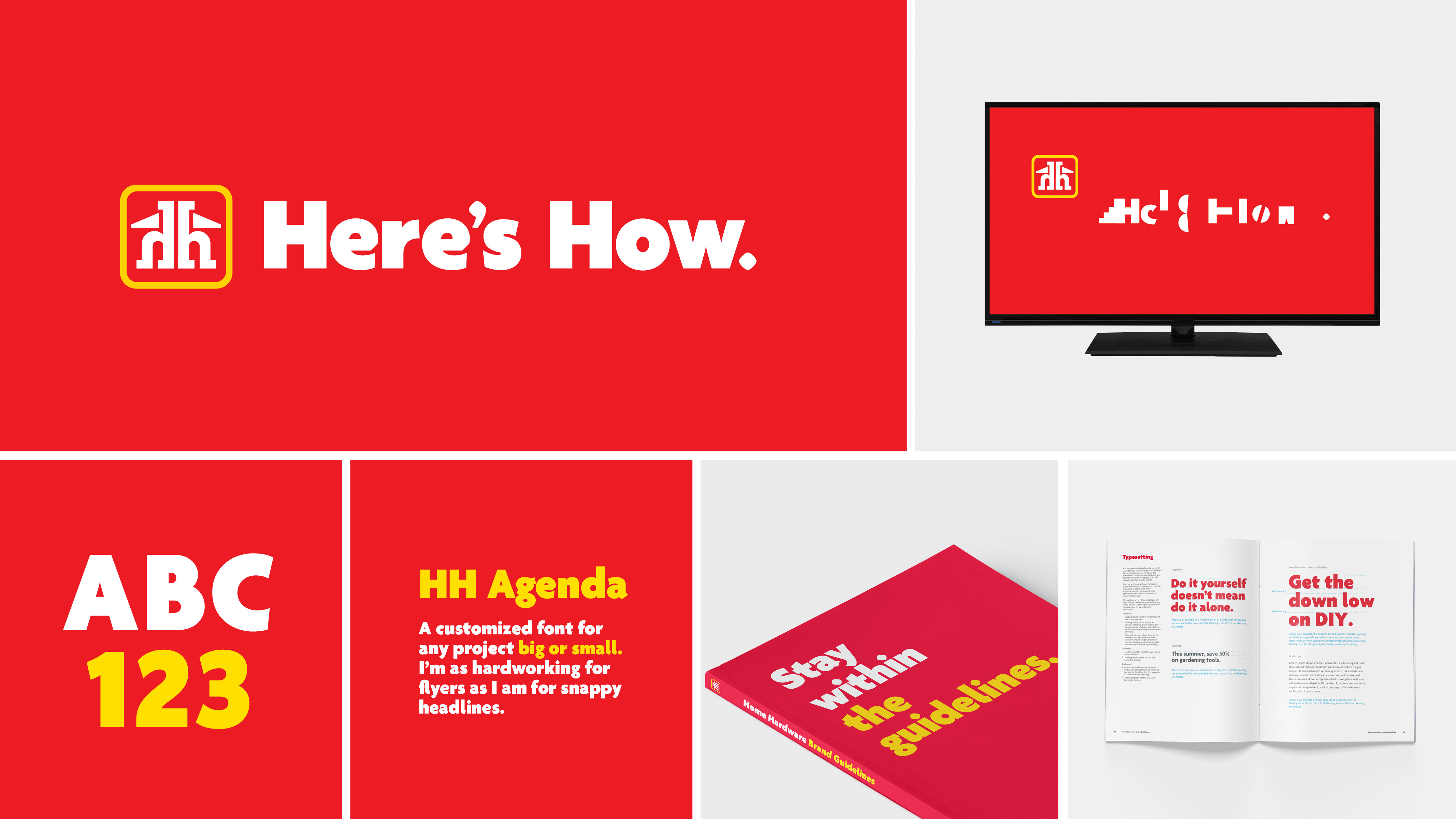
The team started with the typeface, choosing a fresh, humanist sanserif called Agenda. It is a direct reflection of Home Hardware employees’ warmth and approachability with its varying character widths and shapes. But it wasn’t perfect. So the team customized the typeface with some unique updates to optimize it for retail, specifically the flyer, by redrawing the new ‘Here’s How’ tagline to ensure each of its characters was embedded with humanistic elements reflecting the DIY world. Together with the Home Hardware icon logo, the tagline does a lot of the heavy lifting for the new visual identity.
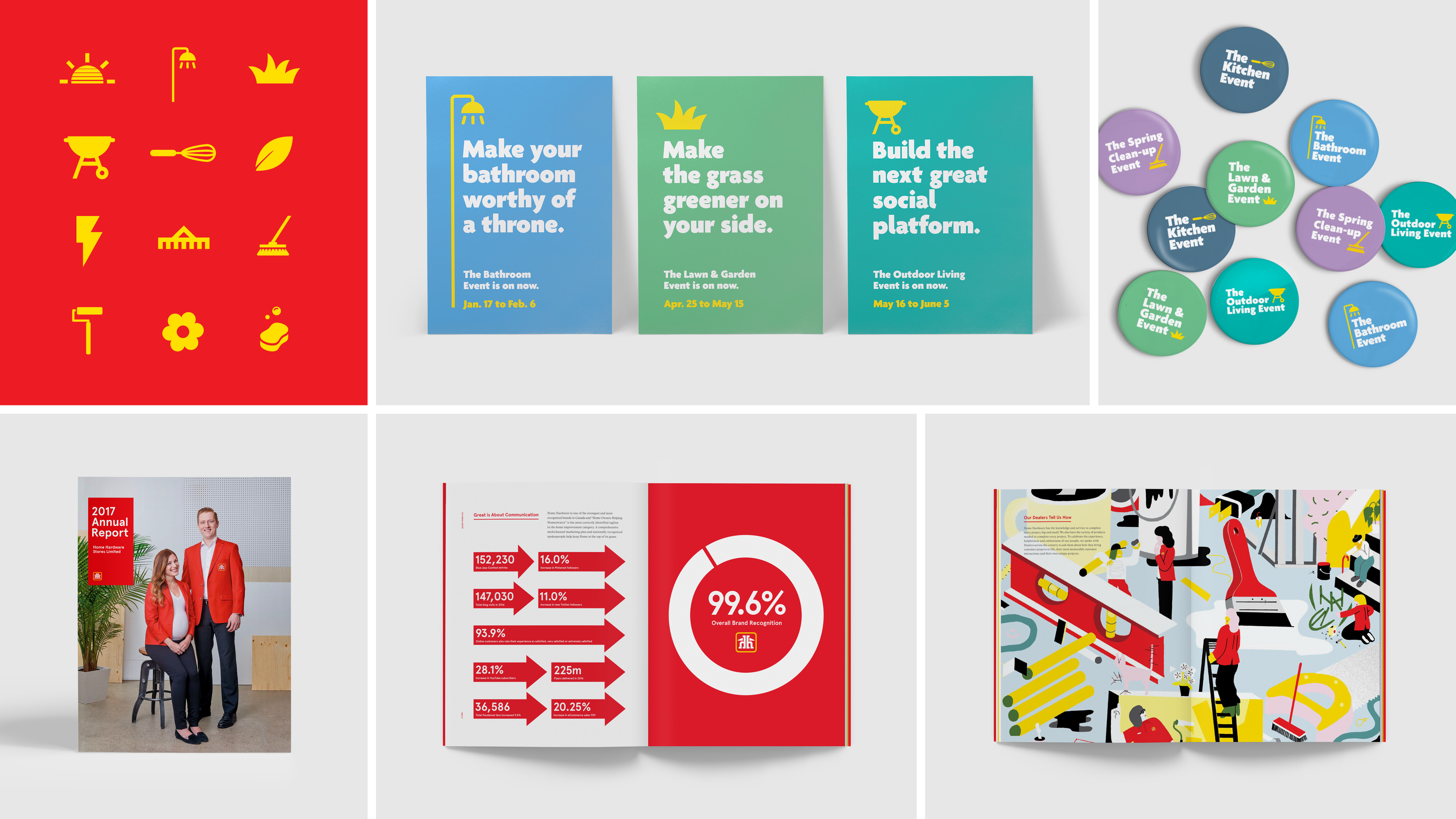
The team then looked at their entire yearly calendar of events (e.g. Lawn and Garden, Outdoor Living, Kitchen, etc.) and developed a modular toolkit of relevant iconography that enabled each event to reflect its theme, yet still feel very much like the brand. Creating a consistent brand look was critical for the brand to evolve. To that end, logo guidelines were created to ensure consistency, no matter where the logo was used. A roster of vibrant, secondary brand colours inspired by the seasons were applied to the Home Hardware palette. And a friendly, conversational tone guideline was made to ensure that the brand had a clear, consistent voice throughout all communications. It became the roadmap for the new Home Hardware brand moving it forward.
The Impact
At the beginning of 2017, Home Hardware sat in 45th place in the Reputation Institute’s ranking of the top Canadian brands. In 2018, Home Hardware had jumped to 21st, a 24-spot jump in the rankings - the biggest gain by far of any company in the survey. More importantly, the dealers were on board. It is important to understand that as an independent dealer network, Home Hardware can’t force the dealers to adopt the new signage and in-store trim kits. Each dealer has to choose to opt in. And they have to pay for the signage out of their own pockets. But since the launch of the campaign, Home Hardware has seen a 14% jump in dealer participation in the optional program despite the fact that it comes with an additional price tag. And from a business standpoint, Moneris data (reflecting consumer off-take) shows an average of 6% increase YoY in sales in the first 6 months from campaign launch.


