2018 Winner
Alcon Dailies Identity Rebrand
Alcon Canada
Bronze Design AOY: john st.
Alcon Canada
Alcon Dailies Identity Rebrand
The Purpose
The purpose of the rebrand was to uncommoditize the contact lens category, and make Alcon the premium contract lens player that people would literally look for in-store.
The Challenge
Surprisingly, given how important our eyesight is, the eye care category is an extremely low involvement category. People have very, very, little affinity for brands in either the lens solutions category or even with their lenses themselves. To that point, despite the fact that people interact with these brands on a daily basis, most people can’t even name what brand they use. The brand needed to make people see this category through fresh eyes again.
The Insight
Most brands of contact lenses look very similar – they all, literally all of them - use water droplets and soft blue-ish colour palettes. But why is this? Clear vision is neither blue, nor soft. It’s crisp. It’s sharp. Perfect vision is binary. You either see something in focus or it is some version of blurry. Clear vision is a black and white issue.
The Execution
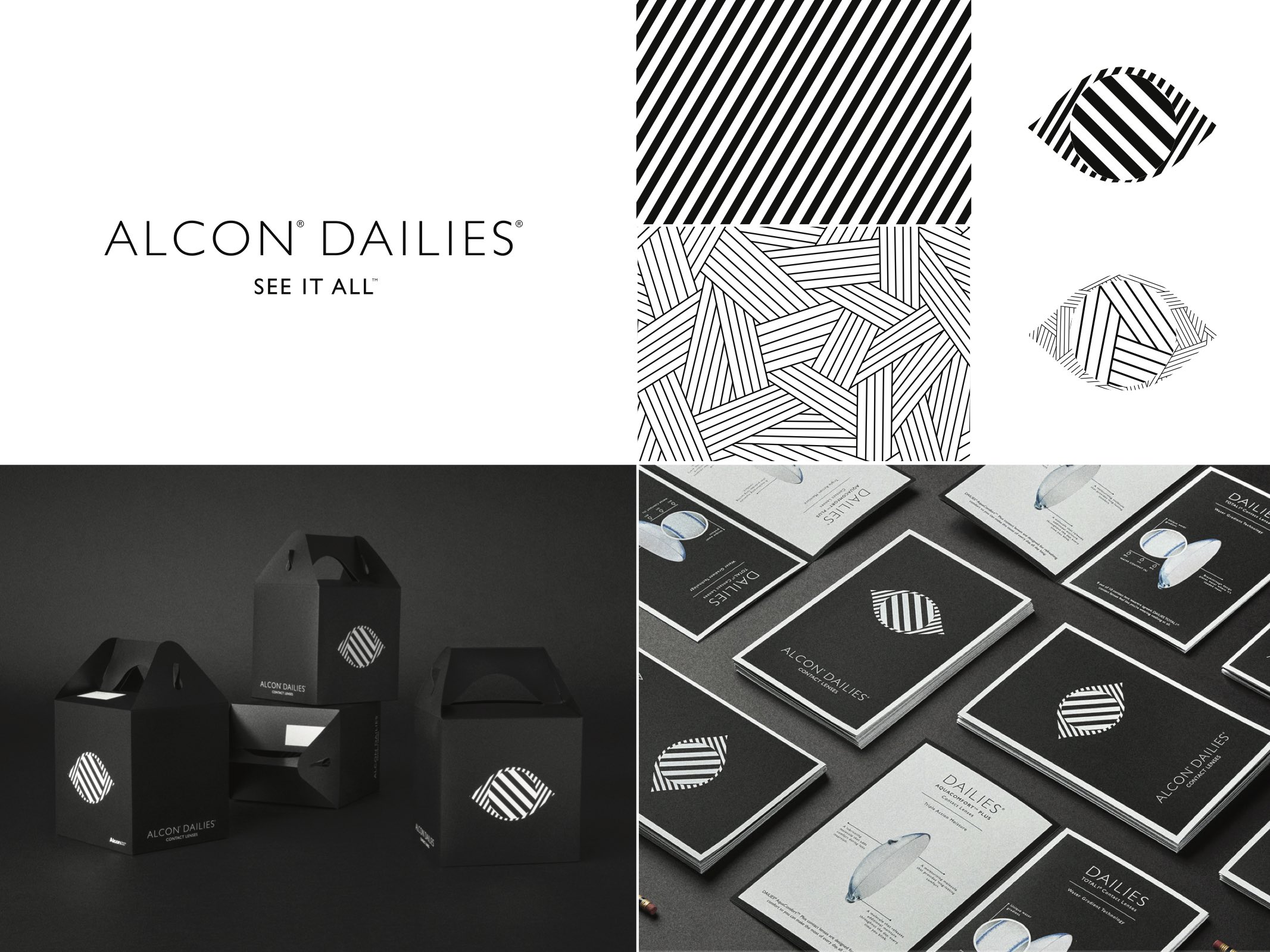
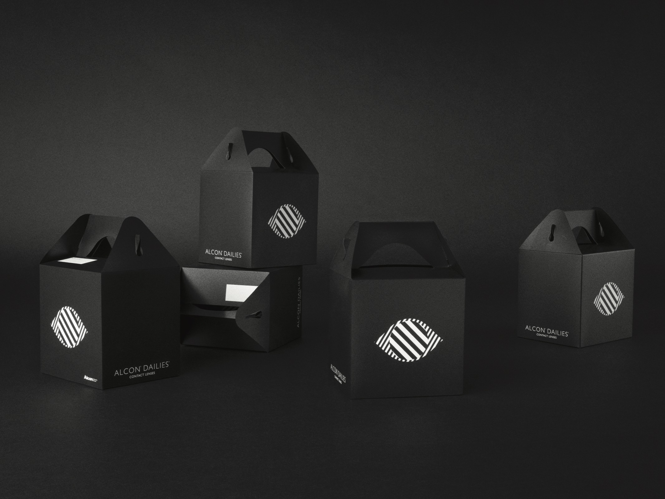
This black and white point of view would affect every part of the rebrand – from packaging, collateral including bags, eye-masks and phone cases to advertising and in-store applications.
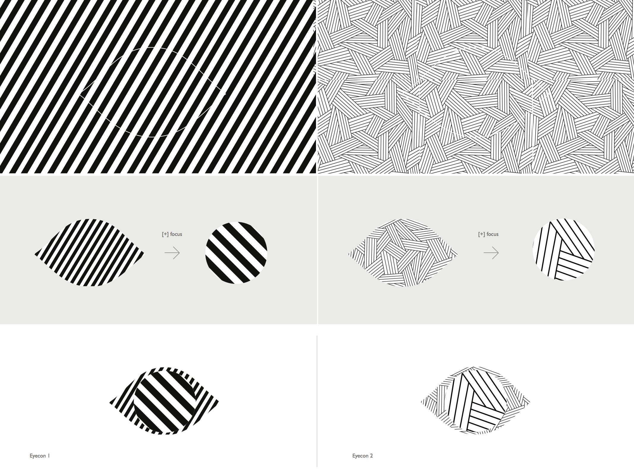
The system was built using only black and white. It used crisp, sharp lines and high, high contrast, to accentuate the idea of perfect vision and focus. The primary graphic language was centered around what we called their new eye-con. This simple element was comprised of a high-contrast graphic black and white interpretation of the eye and the pupil within it. Secondary elements comprised of stark black and white patterns were used to invoke the clarity and the precision that Alcon Dailies provides to the user. The system now stood in stark contrast to the other more commodified brands on the shelf, giving Alcon Dailies a much more premium and distinctive identity.
The Impact
The Alcon Dailies rebrand is just making its way into retail stores now so the sales results aren’t available as of yet. However, presentations to merchants have been overwhelmingly positive, and the Alcon Global team is looking at deploying the new design system worldwide. And Communication Arts (US) and Applied Arts in Canada have already recognized it as one of the top design rebrands of the year.


