2018 Winner
Humanity & Inclusion
Handicap International
Silver Design AOY: Cossette
Handicap International
Humanity & Inclusion
The Purpose
Change the organization’s name and identity to more properly reflect the services offered by this 35 year-old NGO.
The Challenge
Find a culturally appropriate name and universal identity that would work around the world in over 60 countries. Handicap International is a leading NGO (among the top 15) based in France. It was founded 35 years ago and its original mission was to help refugees and people with disabilities. But after 35 years, the name Handicap International had lost social acceptability for the English-speaking world since the term ‘handicap’ has been widely replaced by “persons with disability’. Also, the organization’s name no longer represented the full spectrum of its 6 fields of intervention.
The Insight
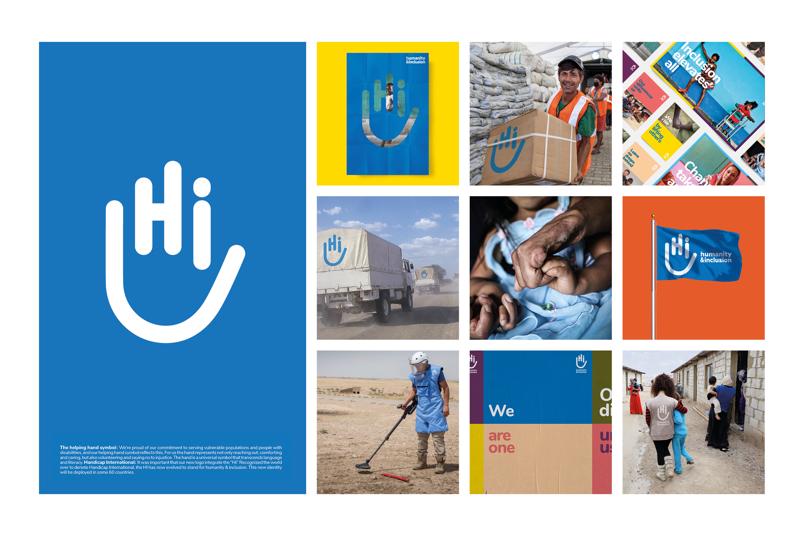
The agency’s international research revealed that the organization’s key stakeholders commonly refer to Handicap International as “HI”. Given the insight about how the organization was commonly referred to by the letters ‘H’ and ‘I’, the team changed the definition of the acronym HI to inject new meaning and inspiration. ‘Handicap International’ became ‘Humanity & Inclusion’. This new name more properly and accurately reflected the organization’s core values. It also communicated one of its key ambitions: to include people with disabilities and vulnerabilities who are so often overlooked. It evoked the fact that HI cherishes differences and fights exclusion.
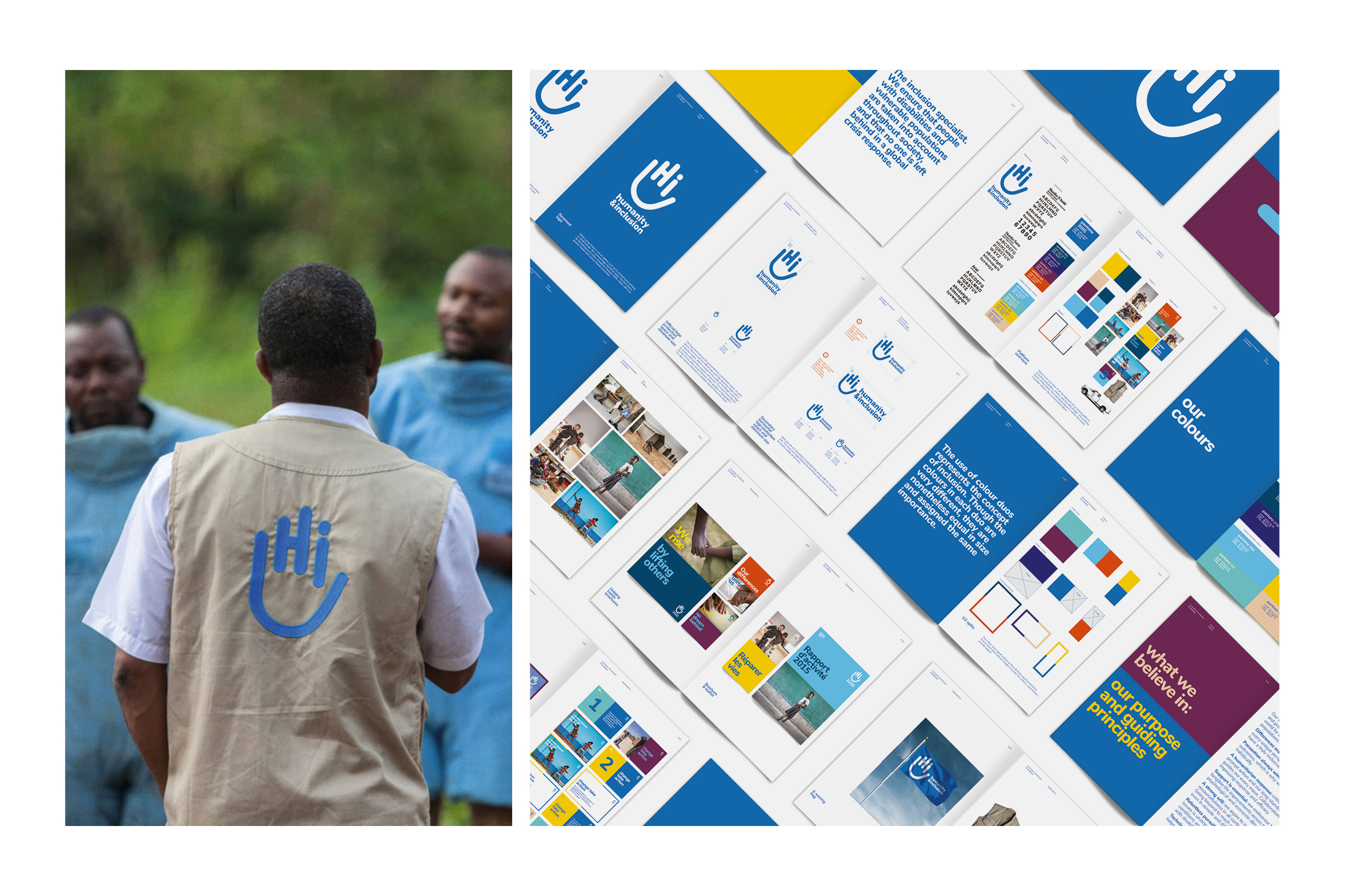
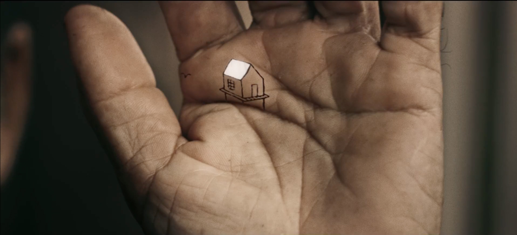
The Execution: New name, logo and branded applications
The new logo uses a universally recognizable and powerful symbol: the human hand. The hand evokes our uniqueness but also helps us remember we are all human. The logo represents the “helping hand” that HI provides to those in need. This helping-hand logo integrates the acronyms of the brand (Hi) while transcending languages and cultures. And it also becomes a hand waving ‘hello’, a symbol of welcome.
The use of rounded typography helps to convey the warm, welcoming and non-threatening presence of humanity. And the use of a vibrant colour palette reflects both the diversity of people who are helped by the organization and the notion of inclusion. A full spectrum of applications was rolled out, from annual reports to packaging to vehicle livery, working apparel for both medical and non-medical staff, posters, stationery and of course the website.
The Impact
Humanity & Inclusion now has an identity that conveys its values, its activities and overall mission with vibrancy, confidence and warmth. The name change and comprehensive media coverage of this campaign had a positive impact on donors, employees, beneficiaries, stakeholders and partners alike. It was instrumental in reviving awareness of HI.
Media coverage has been positive and the overall reaction is unanimous: the new name and platform were welcomed with open arms by the members of the organisation and the donors, adopted in all 60 countries where the organisation is helping. By being more inclusive and global, it’s now easier for each department in the six fields of activity to express their mission and actions in a way that leverages and reflects that of the organization.
This has had a significant impact in employee motivation, helping them recognize the impact they have on vulnerable populations touched by poverty, conflict, disasters and exclusions, as well as their commitment to standing up to unacceptable actions.