2018 Winner
M Telus (Metropolis Rebranding)
TELUS, L’équipe Spectra.
Silver Design AOY: Cossette
TELUS, L’équipe Spectra.
M Telus (Metropolis Rebranding)
The Purpose
Spectra, owner and operator of Montreal’s Metropolis, was looking for a partner to rebrand this iconic music venue, refurbish the building, and enhance the concert experience. A strong supporter of Quebec culture and artists for more than 15 years, TELUS committed to a multimillion-dollar investment over the next 10 years to modernize the venue. The corporate sponsorship deal resulted in a name and identity change. The mandate was to create a rebranded identity for Montreal’s Metropolis concert hall as part of a partnership between TELUS and the venue's owner/operator, L’Équipe Spectra.
The Challenge
How do you rebrand an icon without killing its soul? It happens all the time. A corporate sponsor partners with a beloved cultural icon and before you know it, what made it an icon somehow gets lost in translation as the corporate brand washes over it. Any personality or idiosyncrasy it once had disappears behind the anodyne badge of its corporate sponsor. How do you keep the spirit of the original brand alive while acknowledging the presence of a new partner?
The Insight
You can rename it and rebrand it but it will always be remembered as Montreal Metropolis. David Bowie. Beck. Green Day. Radiohead. Bjork. Coldplay. They all played at the Metropolis. And if you saw any one of them there, the venue’s original name will be forever burned into your memory, just as if you’d seen them at CBGB in New York or The Fillmore West in San Francisco. The challenge is to find some element of the original to latch onto, something that will connect the old to the new.
The Execution
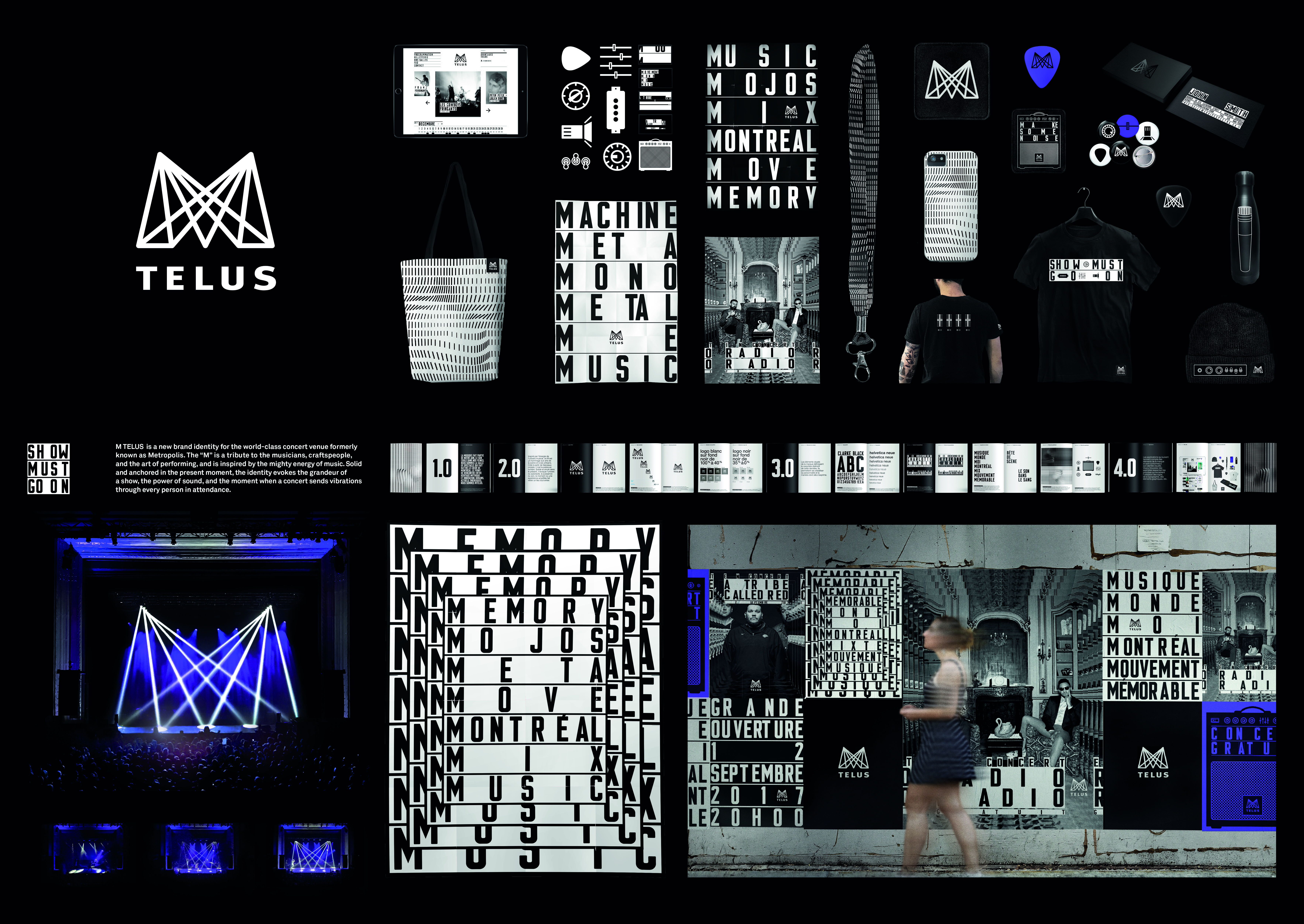
The connection was the letter ‘M’. ‘M’ for Montreal. ‘M’ for Metropolis. And ‘M’ for MTELUS, which became the venue’s new name.
To keep the spirit of the place alive, and to respect this venue’s connected and urban crowd, every element of this brand identity had to evoke the thrill of a show, the power of sound, and the moment when a concert experience sends a shiver down the spine of everyone present.
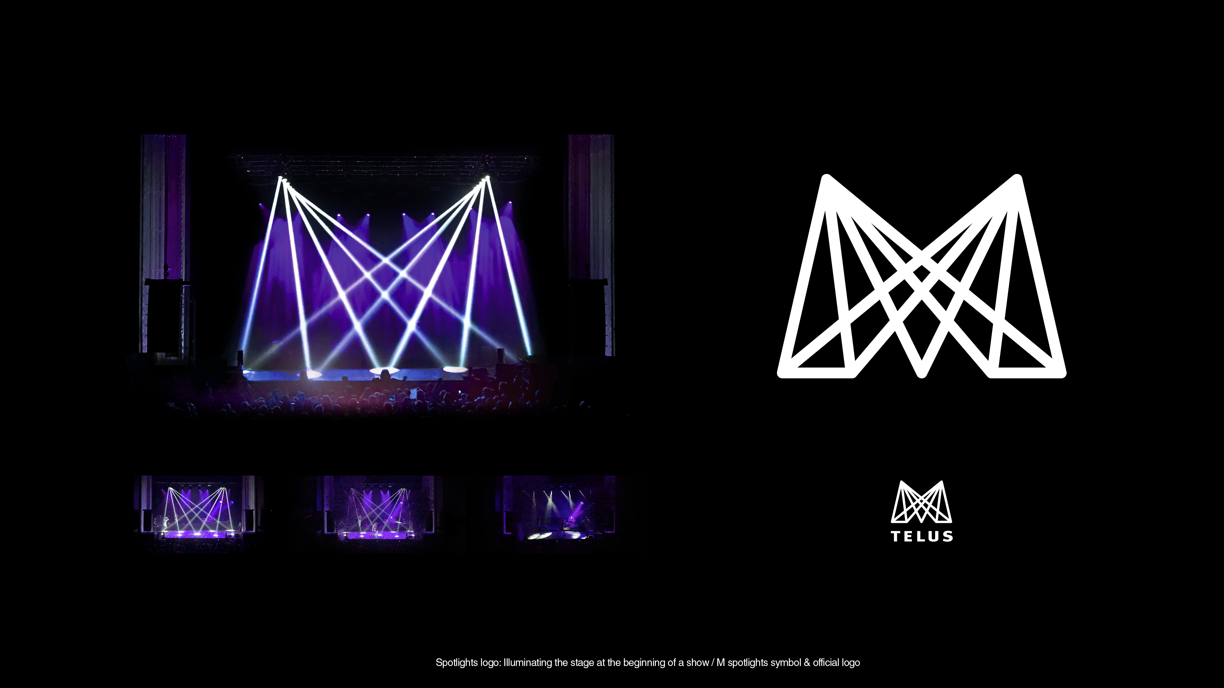
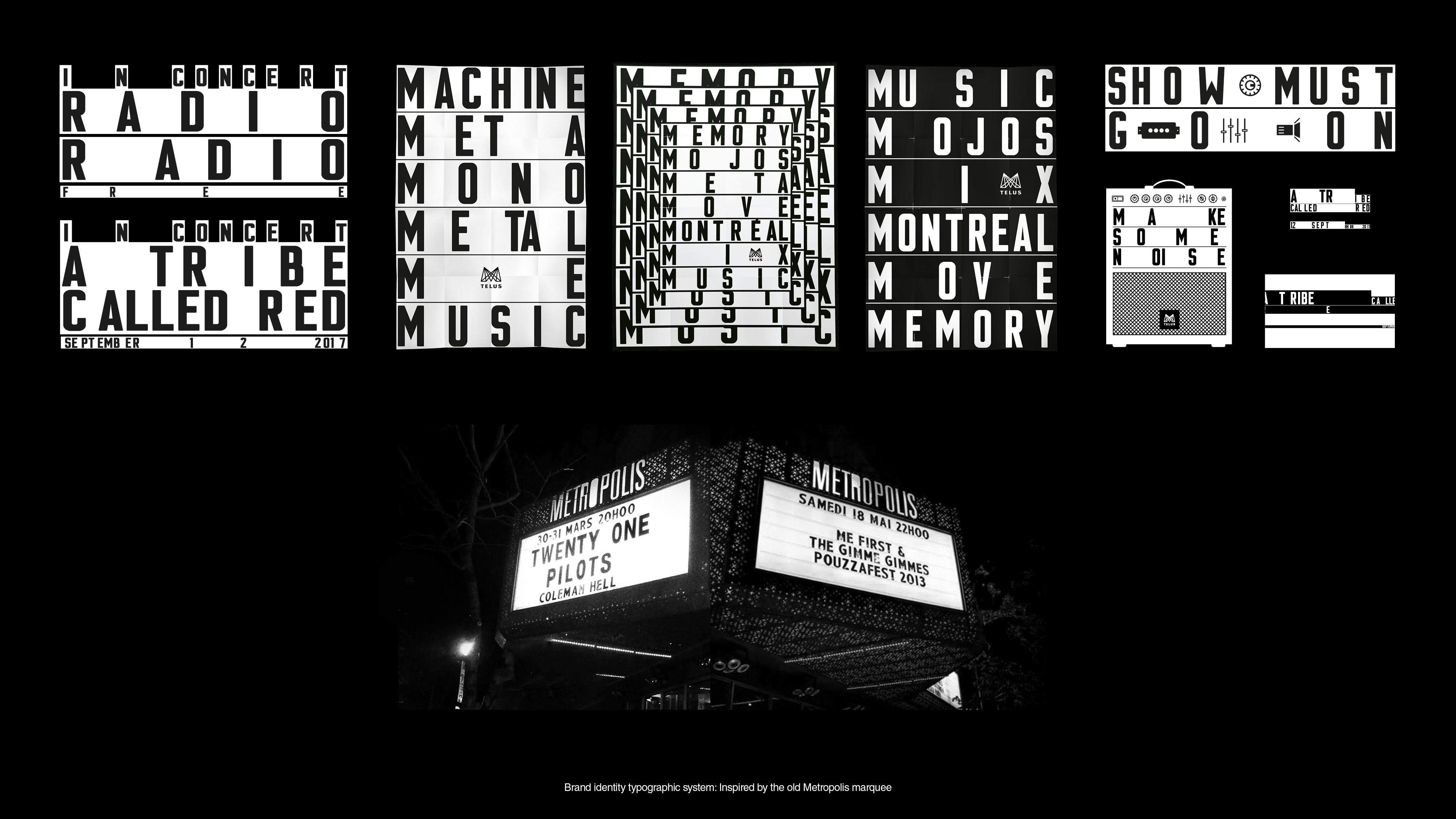
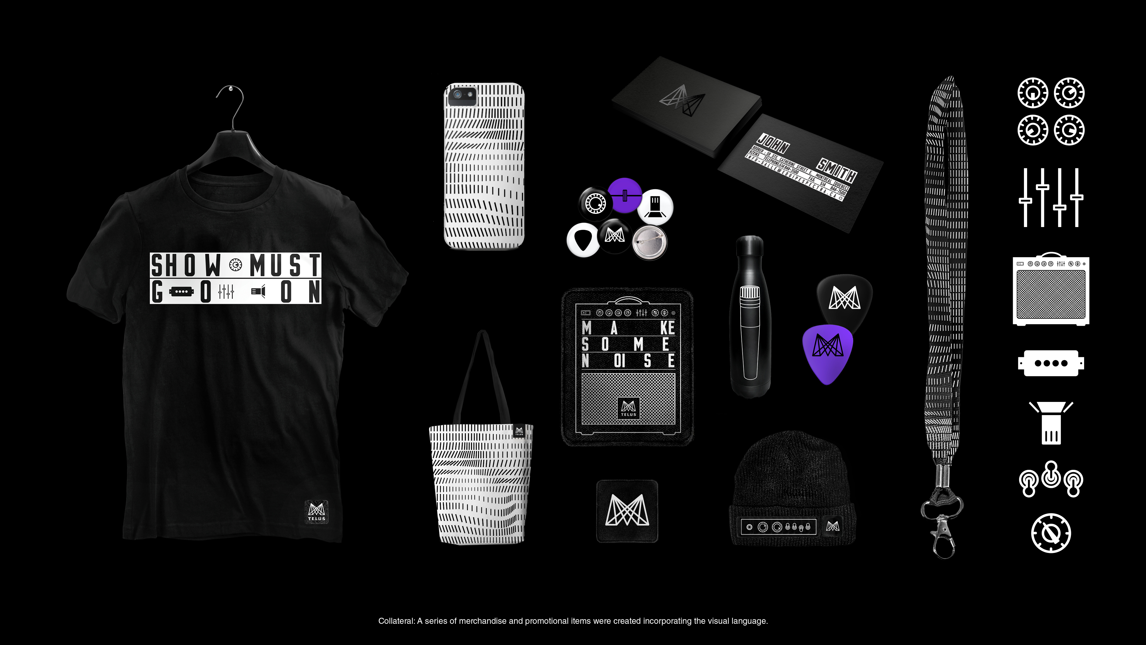
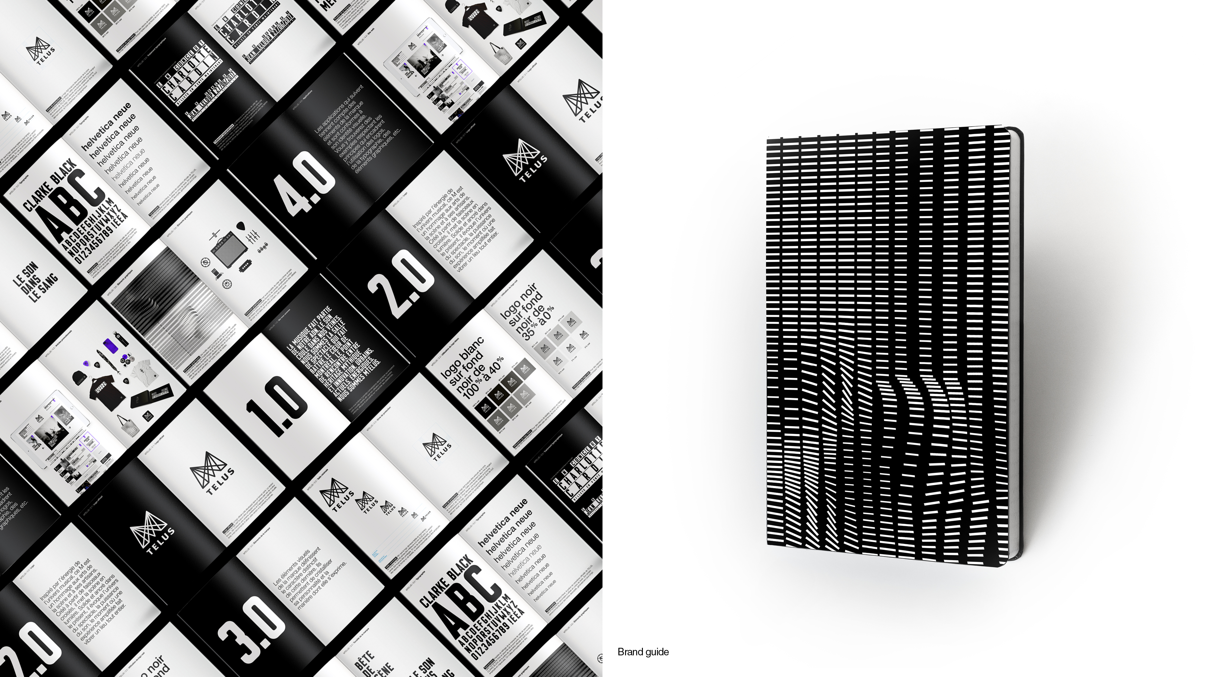
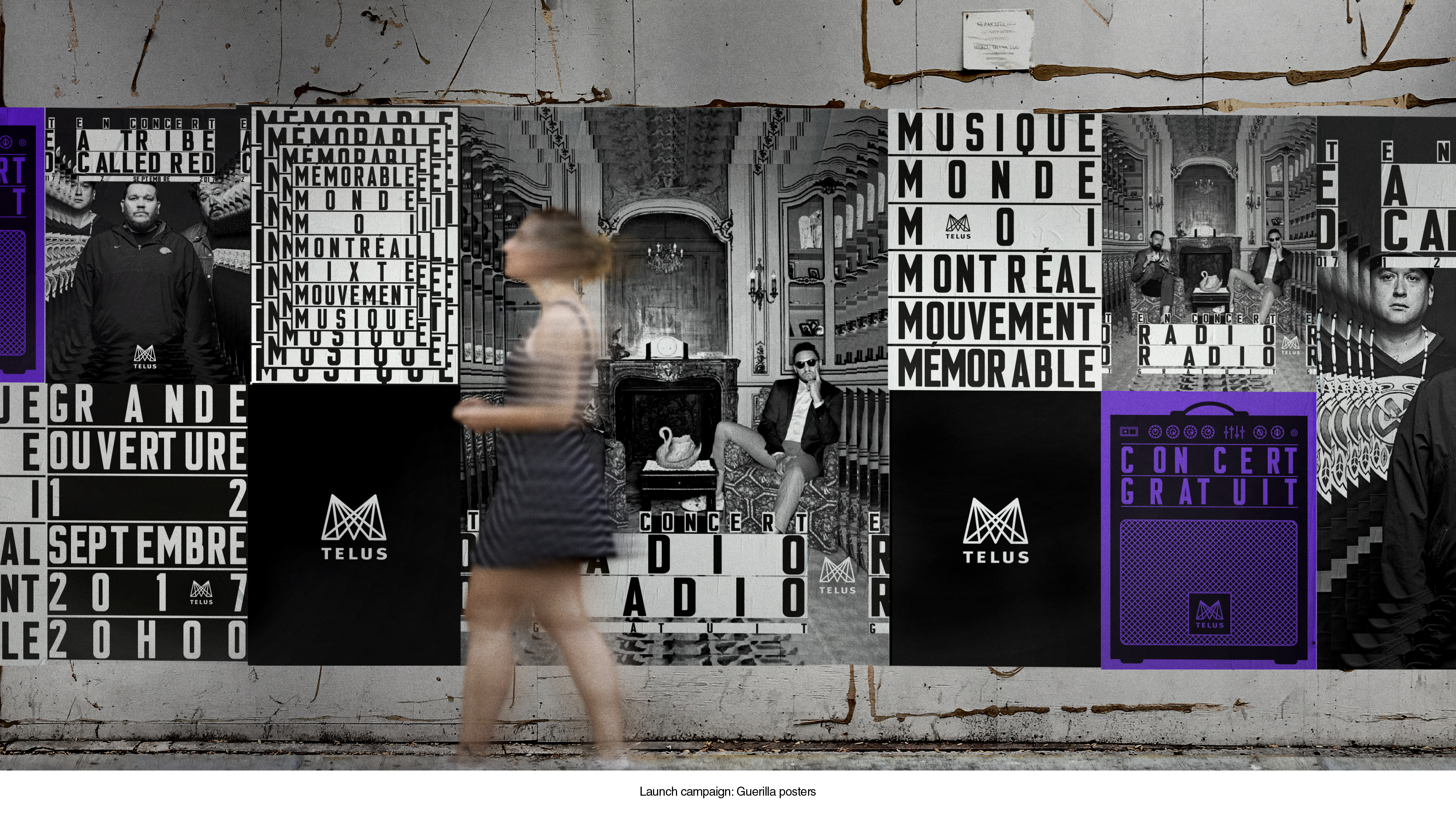
The new ‘M’ logo was inspired by spotlights sweeping across the stage. The agency did not only made a graphic version, but were able to recreate the logo with actual spotlights on stage before shows. The team applied the theme of music—its energy, rhythms and icons—to every aspect of MTELUS’s visual identity, including merchandise, uniforms and decor. It developed imagery reminiscent of a feedback effect, evoking pulses, knobs, switches, rhythms, beats and spotlights. Every symbolic element of this rebranding visually speaks to live musical experiences. Also as a nod to the past, the team created a typeface based on the original venue’s marquee, complete with the kind of awkward gaps between letters that you often see on the marquees of old school repertory cinemas.
The Impact
Along with a revamped sound and lighting system, the new branding saw MTELUS reaffirm itself as Canada’s number one music venue. MTELUS can look confidently towards the future, once again attracting major acts that demand first-class facilities and décor.