2018 Winner
Follow The Arches
McDonald's Restaurants of Canada Limited
Gold AOY: Cossette
McDonald's Restaurants of Canada Limited
Follow The Arches
The Challenge
There are many number of billboards across the urban landscape that attempt to guide drivers to the nearest McDonalds. While they are all recognizable as McDonald’s signs, no two are the same. The use of McDonalds’ visual identity in this context completely lacks consistency. The challenge was to transform out of home billboards into directional signage as well as brand communications.
The Insight
The McDonald's Arches are a prominent recognizable symbol in the world and is visible in more than 120 countries.
The Idea
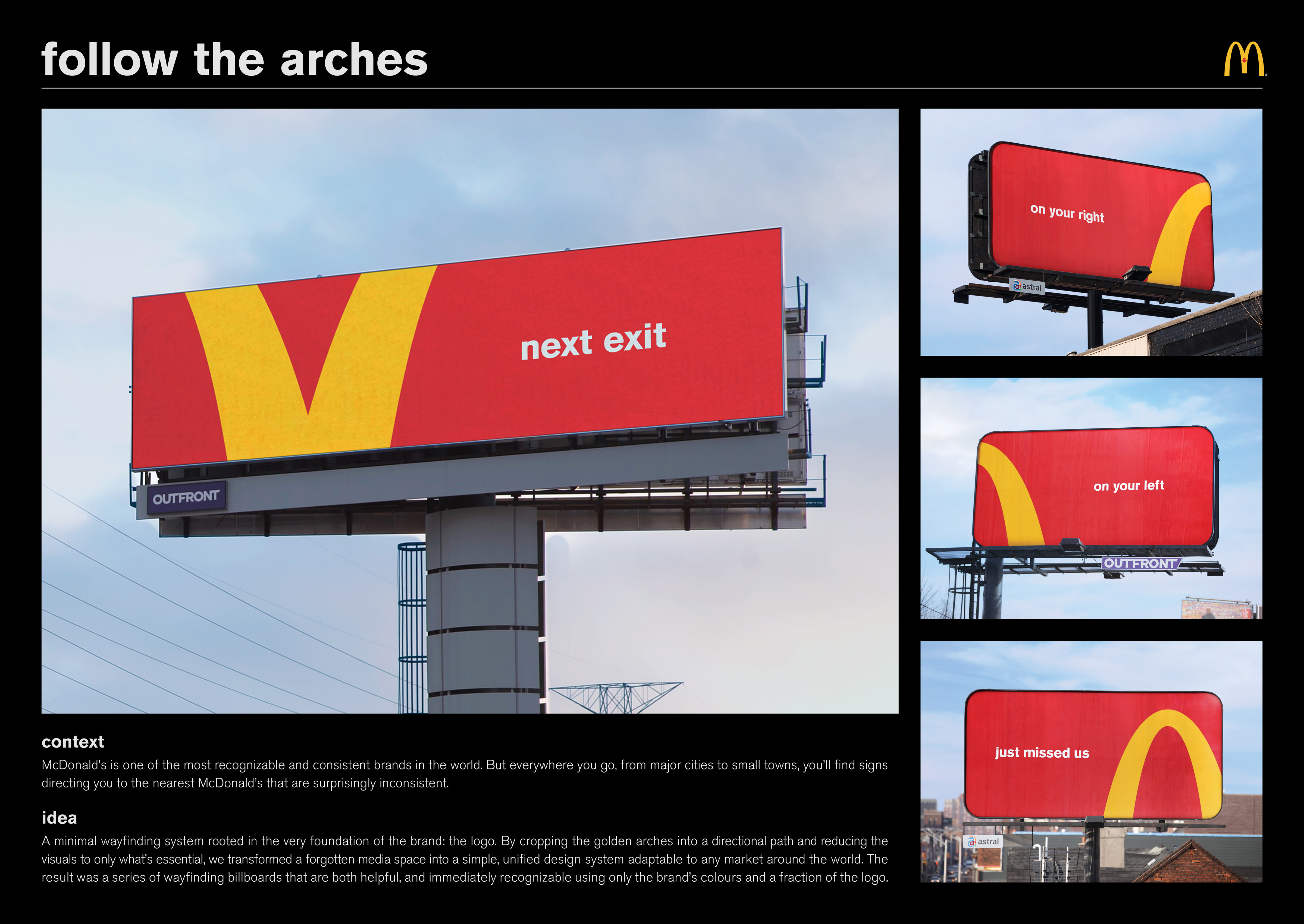
To unlock the hidden potential of the Arches logo to be used as directional signage. When the Coca Cola bottle was originally designed in 1915, the brief was to make it recognizable even if it was lying in pieces on the ground. Same goes for McDonalds: Like the Coke bottle, the Arches logo is ubiquitous and firmly planted in the minds of. People are often challenged to look at small pieces of famous logos to determine just how little of the logo they need to see in order to recognize it. It’s almost become a parlour game. So if they have the ability to recognize a brand by looking at only a fraction of it, why not leverage this power to direct them to the nearest location, while building a little brand equity at the same time?
The Plan
The campaign consists of four billboards (three static and one digital) in high traffic areas across downtown Toronto and the GTA. The famous yellow arches were broken into 4 different pieces to match the accompanying copy: “Next Exit”; “Just Missed Us”; “On Your Left”; and “On Your Right”. Each of the four variations utilized a different section of the arches to get the point across. The boards were simple and consistent, with minimal colours and text. The concept demonstrated how recognizable the McDonald’s symbol has become, even when only portions of it are revealed, thus reinforcing the brand’s equity in the minds of consumers. The boards appeared within short distances of McDonald’s restaurants in high traffic areas with clear visibility from street level. They were also distance tested with typography sizing consistent with road signs.
The Results
With “Follow the Arches” the agency created a wayfinding system that works in any language and is now ready to be executed as a global campaign in the more than 120 countries where the brand operates. As evidence of its global relevance, the campaign has been awarded Cannes Lions Outdoor Grand Prix, One Show Design Gold & Outdoor Gold, D&AD Outdoor Wood Pencil and Strategy Marketing Awards Best in Show, all in 2018.

