2018 Winner
DesignThinkers 2018
RGD
Gold Design AOY: Zulu Alpha Kilo
RGD
DesignThinkers 2018
The Challenge
The brand needed to get the attention of the toughest audience of all: its peers. With design peers as the target audience, the pressure was on to deliver a conference identity that they would endorse.
The Insight
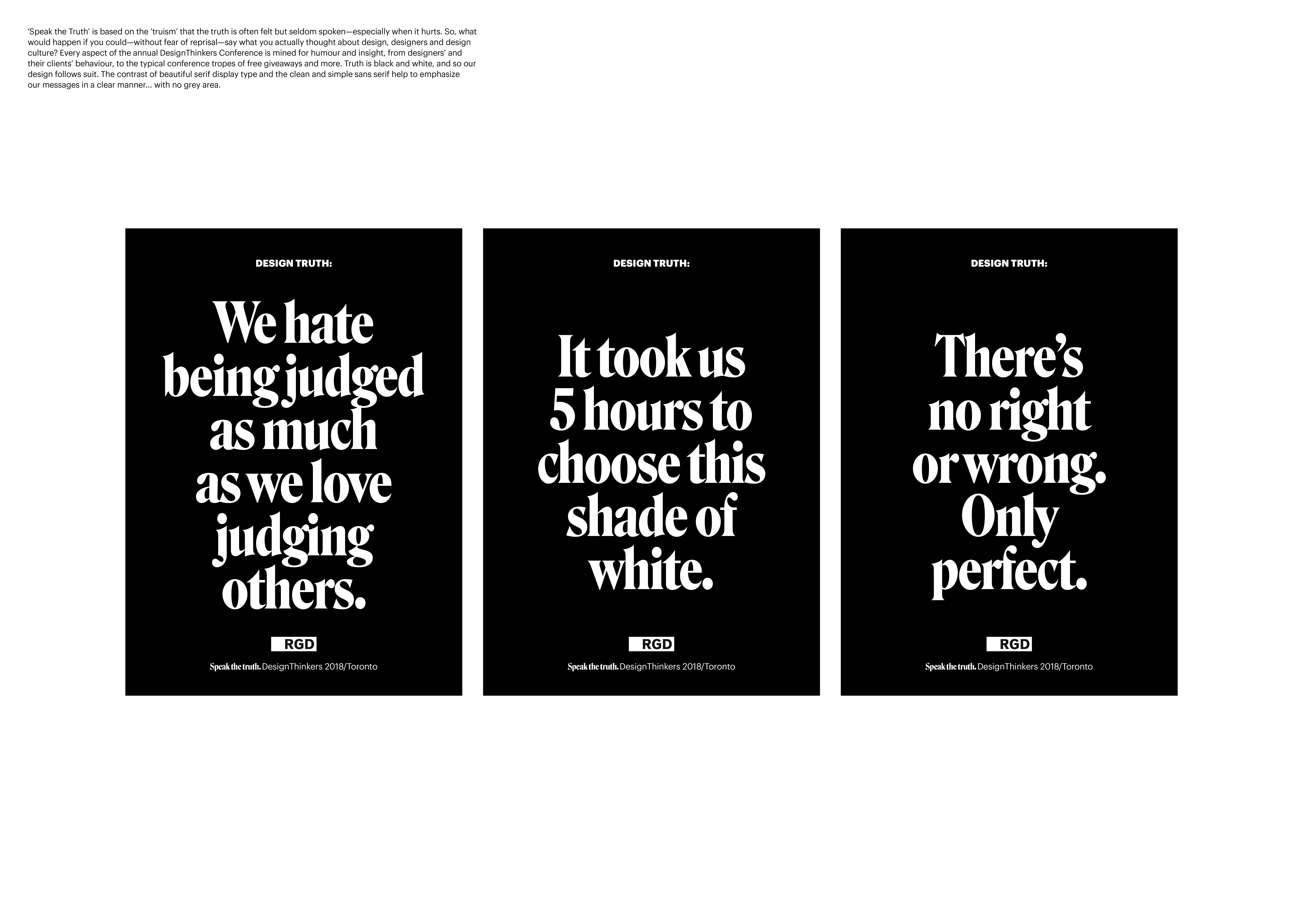
Speak the Truth is based on the ‘truism’ that the truth is often felt but seldom spoken – especially when it hurts. At one time or another, every designer has talked trash about their colleagues, competitors and clients, but normally not in public. So what would happen if you could – without fear of reprisal – say what you actually thought about design, designers and design culture?
The Idea
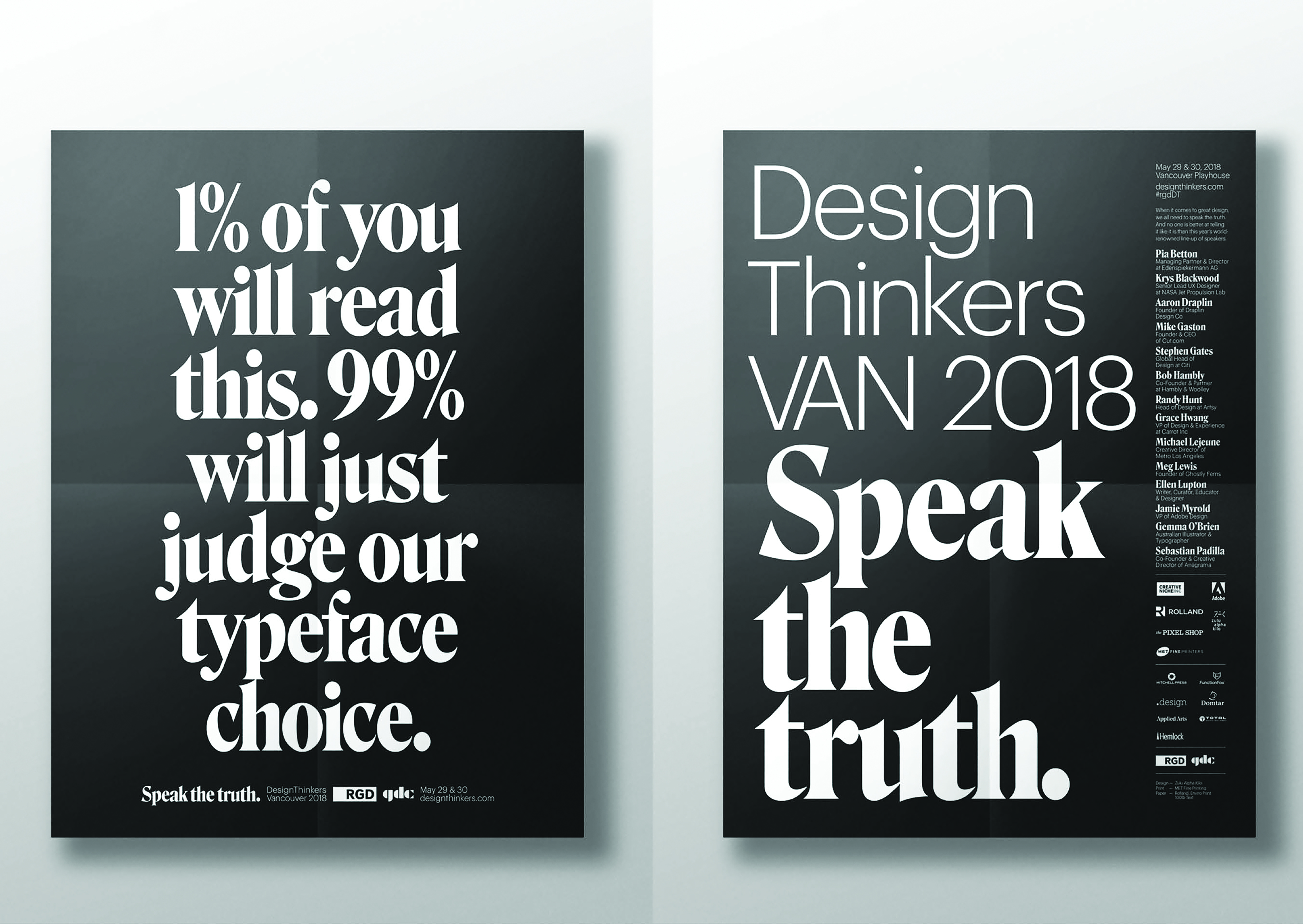
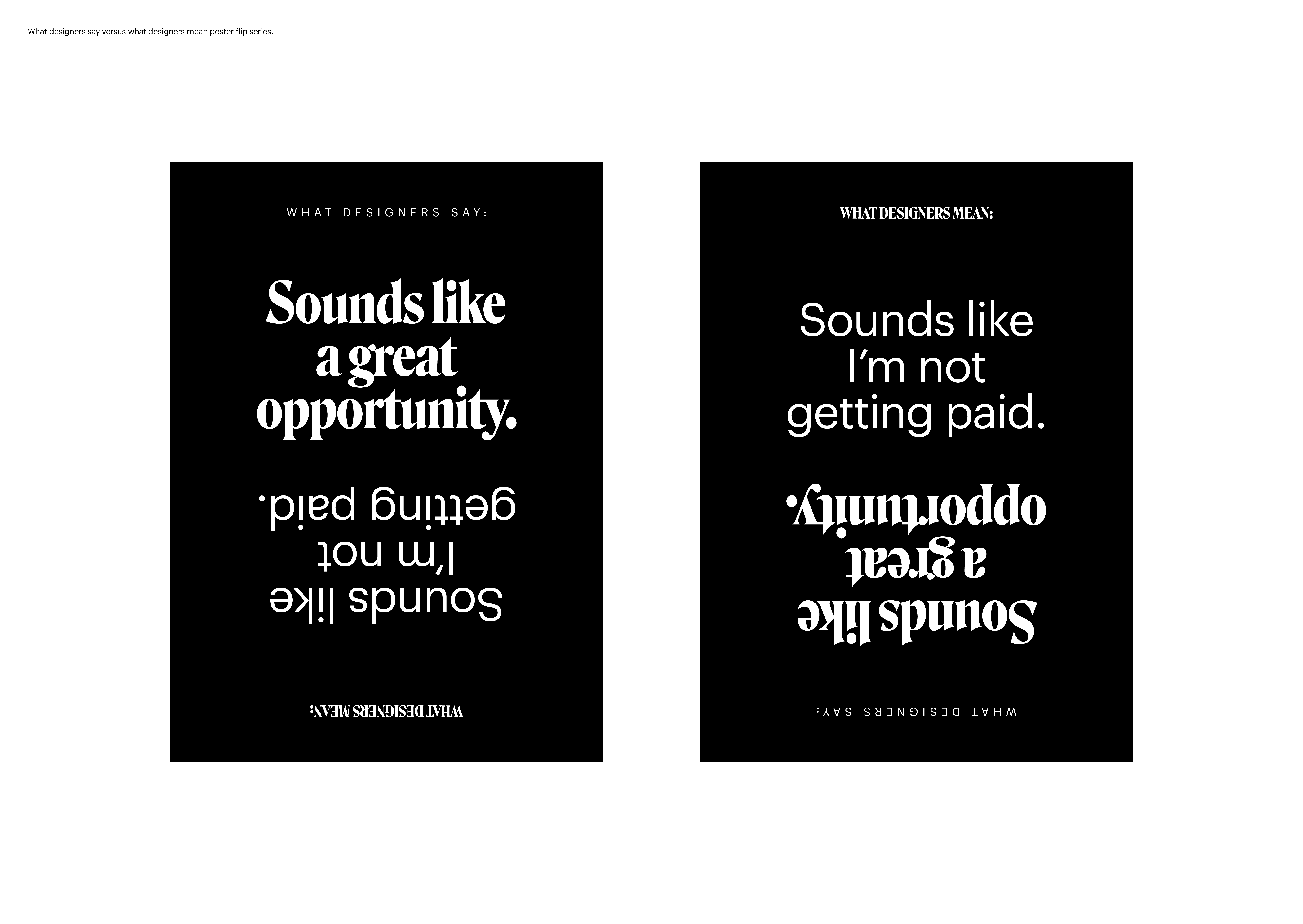
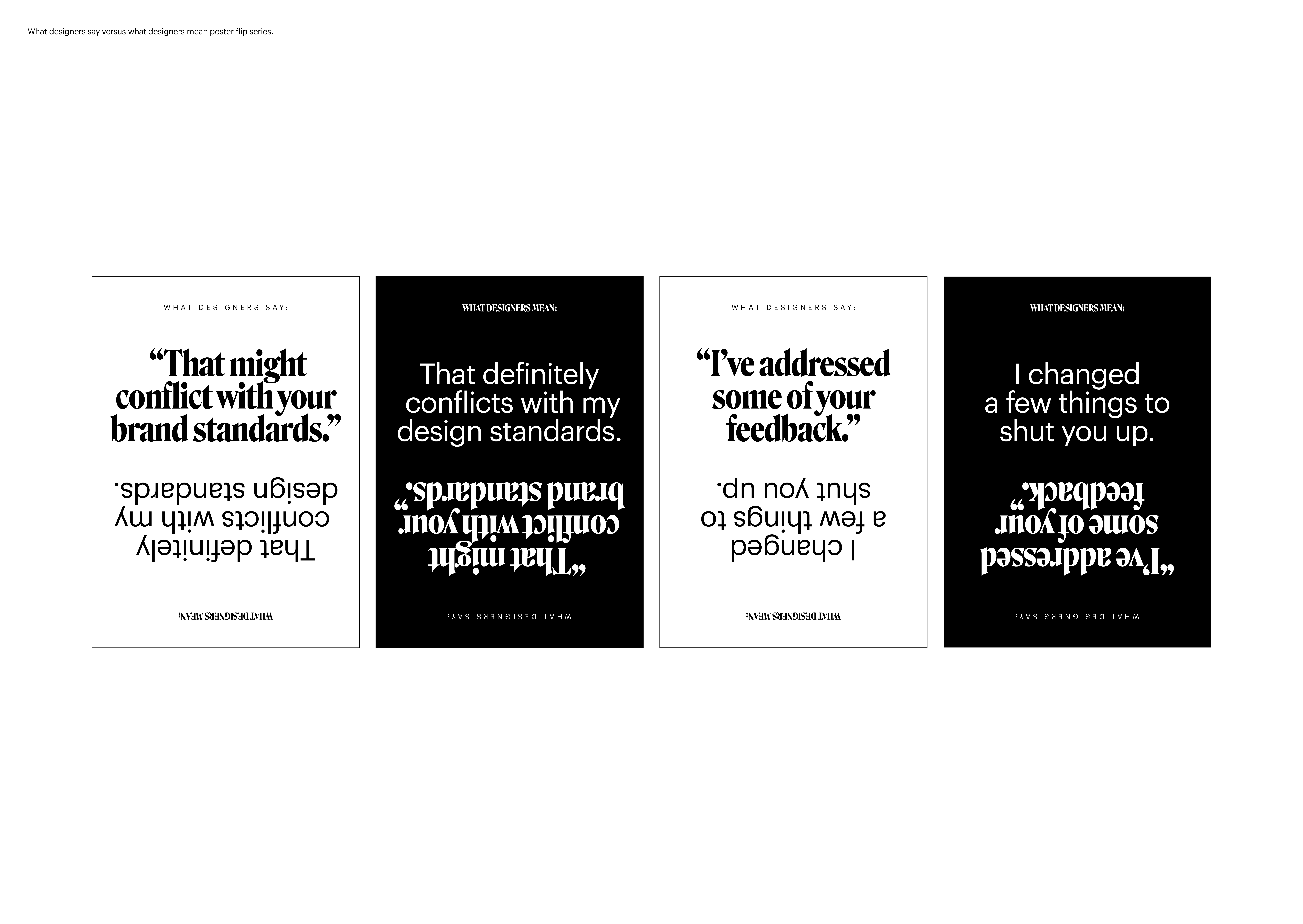
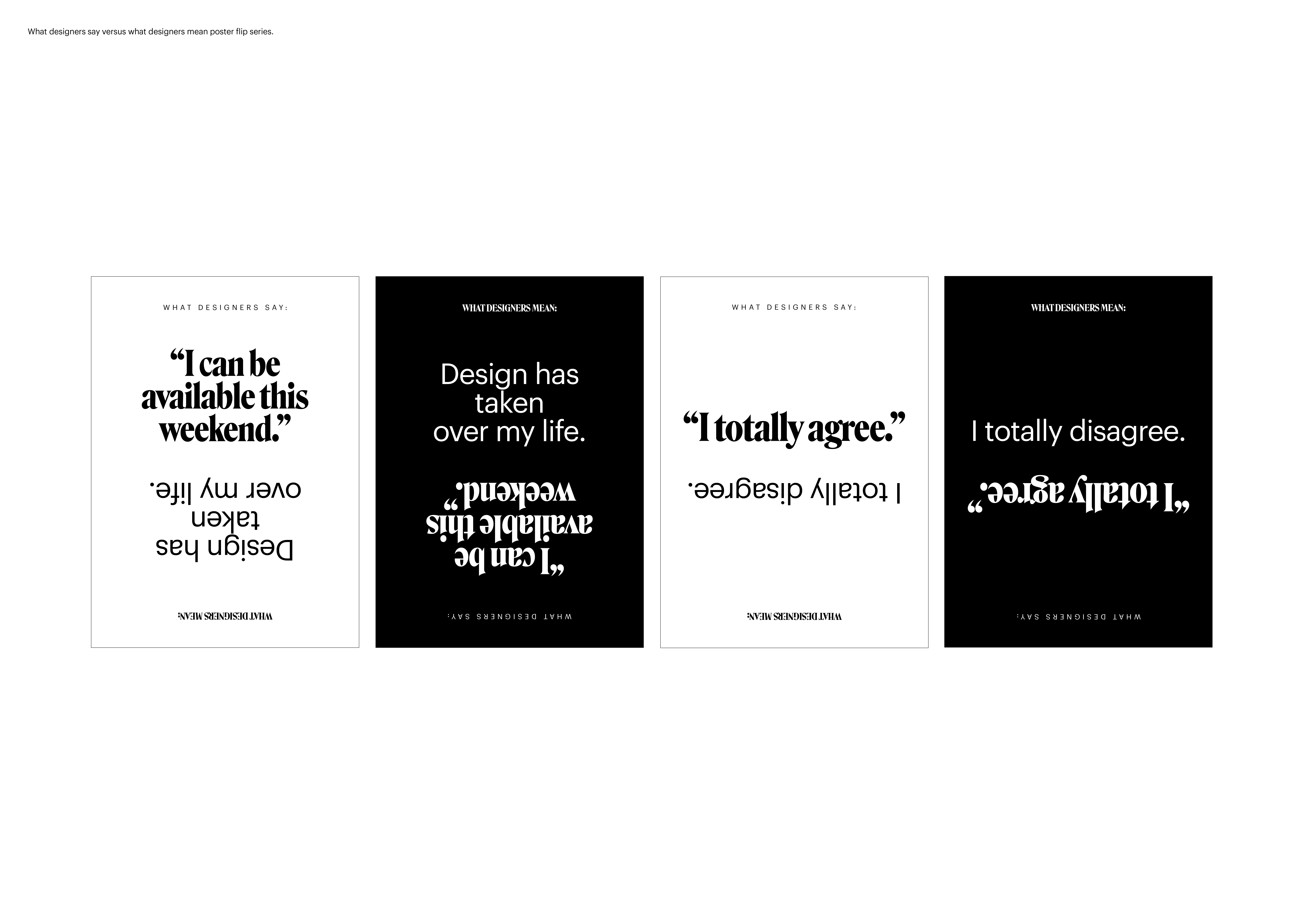
The agency tapped into the foibles, stereotypes and clichés we've all come to associate with design. Clichés like our obsession with wearing black. Or the fact that many of us would rather nerd out over a typeface than read what it says. All of these design truths were turned into trash-talking headlines. Self-effacing but in a way that says “every one of us has experienced this at some point in our careers." Ultimately, Speak the Truth asks us to laugh at ourselves.
The Design Solution
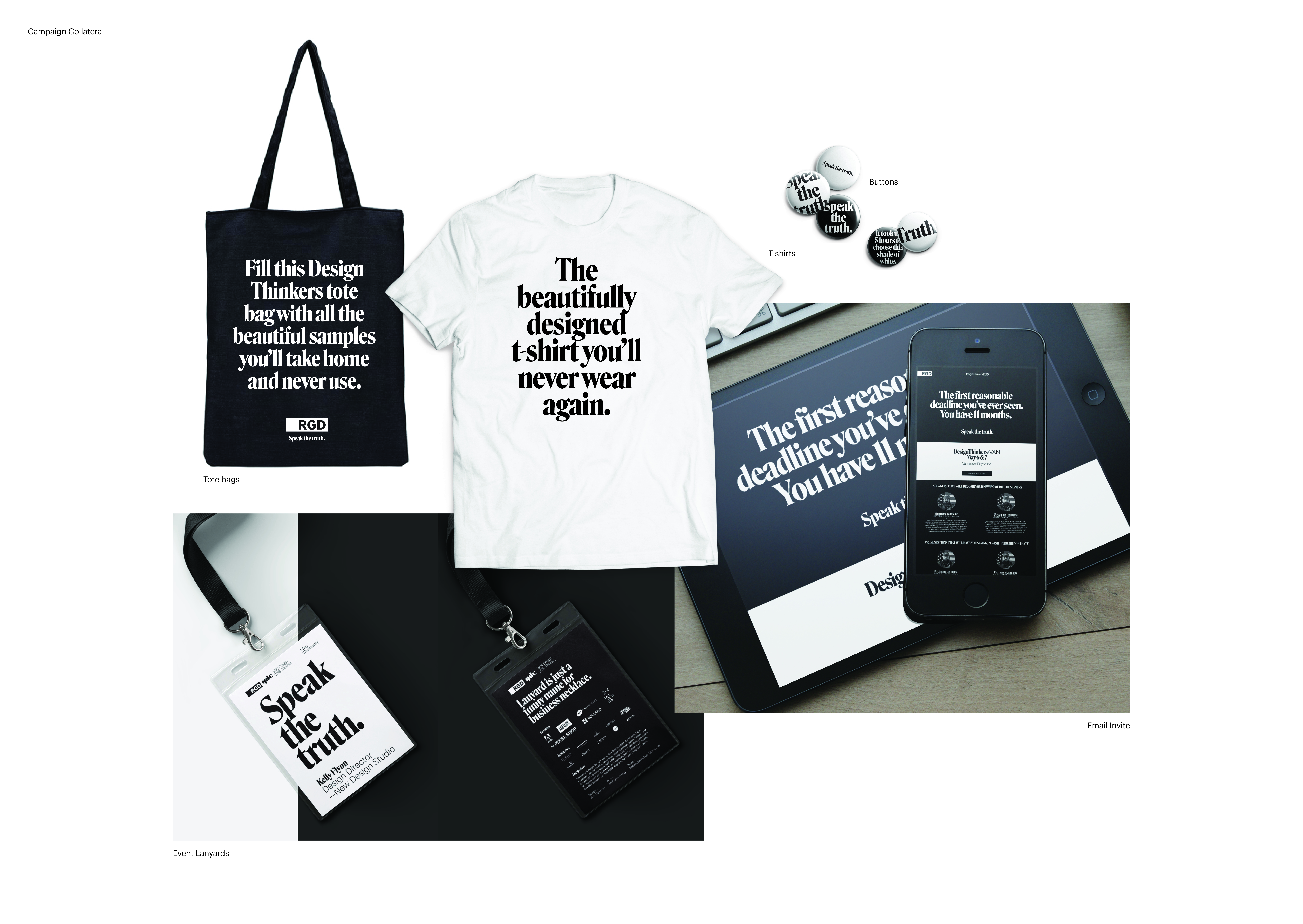
The team let the truth become its identity. Using just words, it turned designed clichés into truthful posters, truthful conference materials, truthful lanyards, truthful t-shirts, even truthful tote bags. All of which was achieved by simply using typography and every designer’s favourite colour as the backdrop.
The Execution
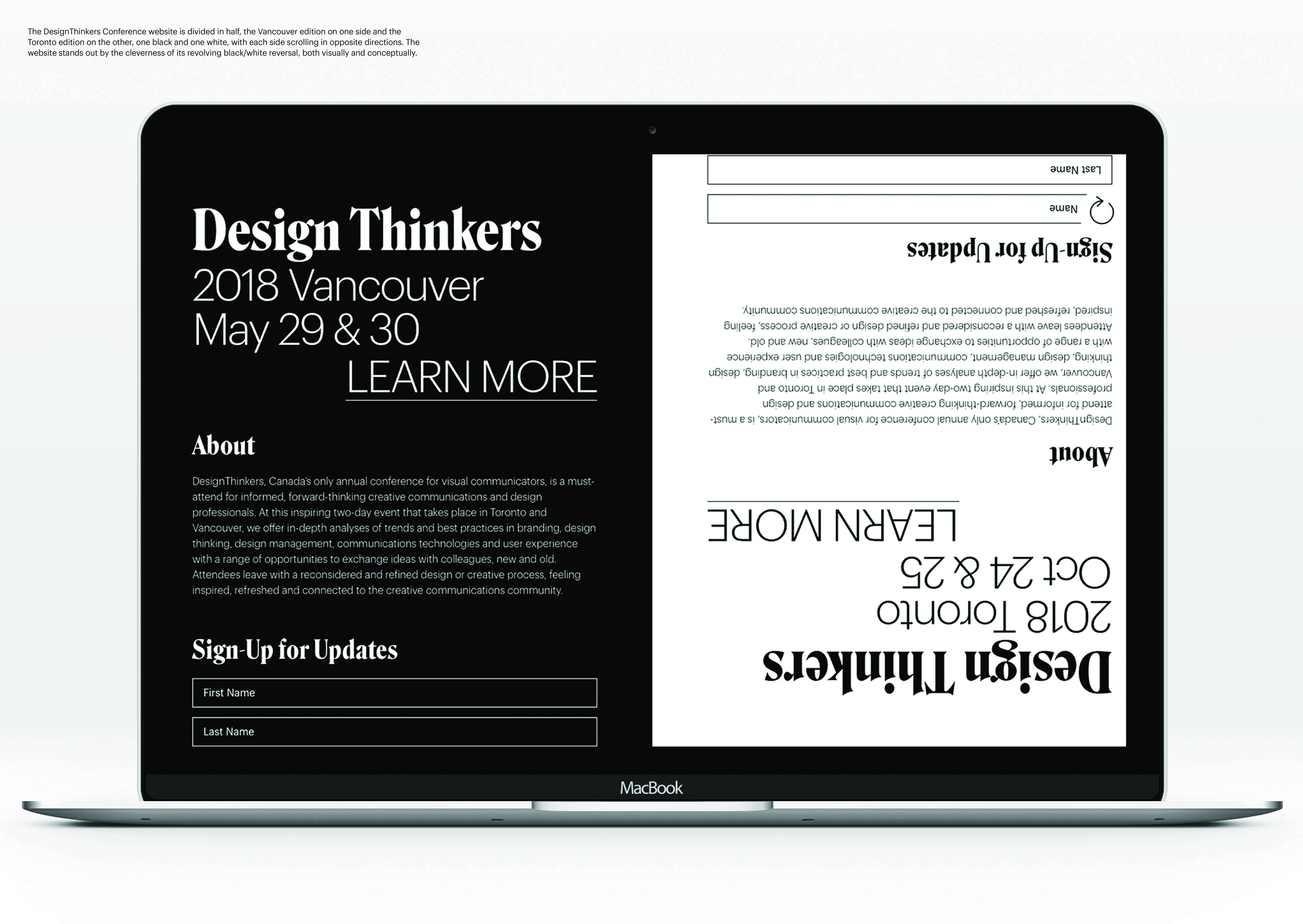
From designers’ and their clients’ behaviour to the swag bags attendees take home after the conference, every aspect was mined for insight and humour. Aside from the requisite posters and print collateral, two elements stand apart. One is a short video in which industry leaders are subjected to a lie detector test with some revealing truths. The video’s deadpan delivery and visual austerity heighten the humour of the overall theme. The other is a conference website in which the page is divided in half, the Vancouver edition on one side and the Toronto edition on the other, one black and one white, with each side scrolling in opposite directions.
The Impact
Speak the Truth managed to use the stereotype of the famously fragile designer ego to drive 15% higher ticket sales than the previous year, thereby fulfilling its mandate to increase attendance. It even struck a chord with the global design community. Legendary designer Aaron Draplin weighed in on this year’s identity:
“It's a scary time.
There's an assault on truth.
And yet, truth still prevails.
The Speak the Truth theme was perfectly on point.”
- Aaron Draplin
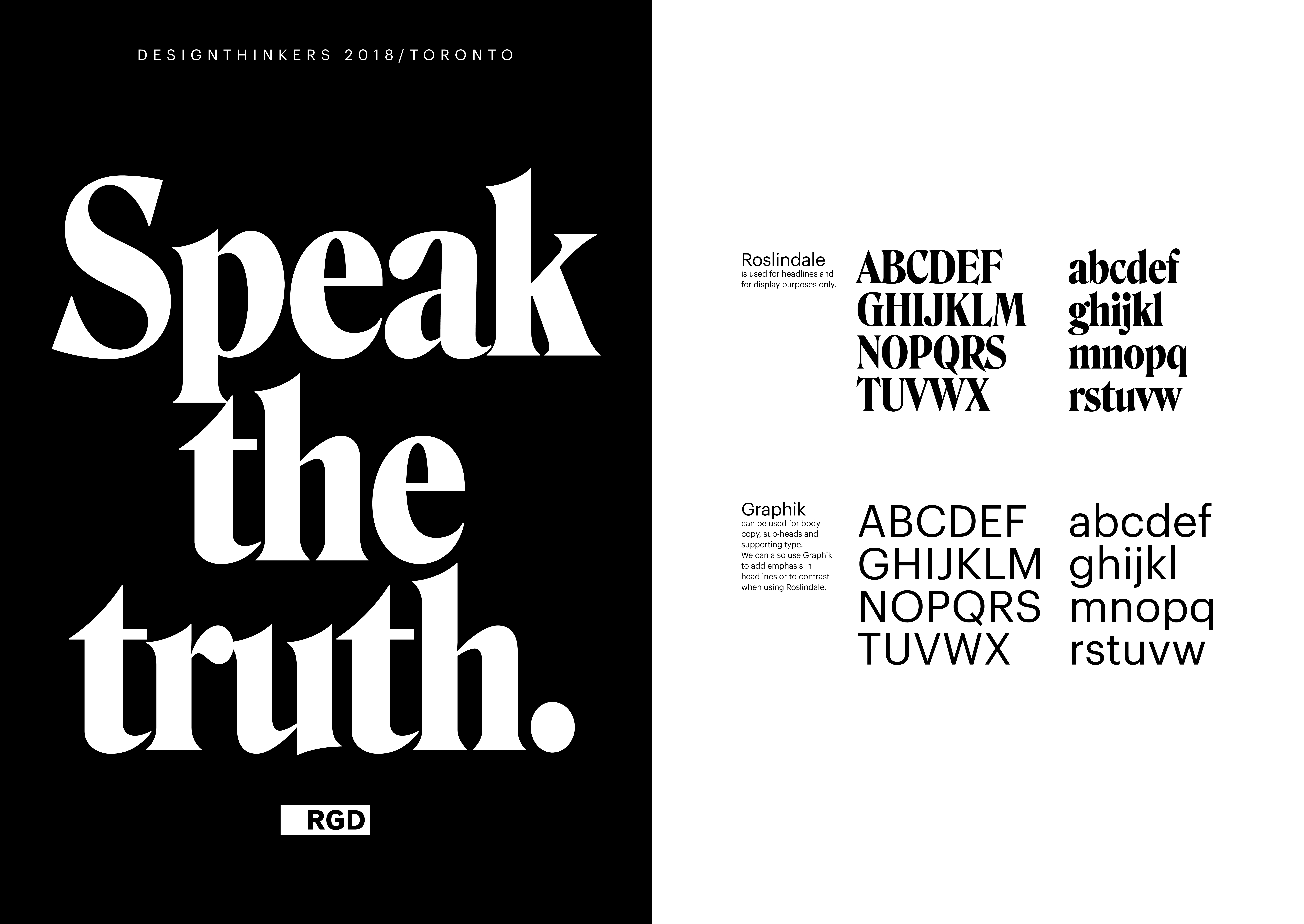
The other impact was anecdotal: The bold serif font used for the project caused quite a buzz in the design and art direction community. As a copy-dominated campaign, the typeface is the visual content, so it needed to be carefully considered. The font – called Roslindale –prompted lots of inquiries from the community as to where it came from, which in turn drove greater interest in the event. The identity has been featured on blogs and design sites around the world.

