2018 Winner
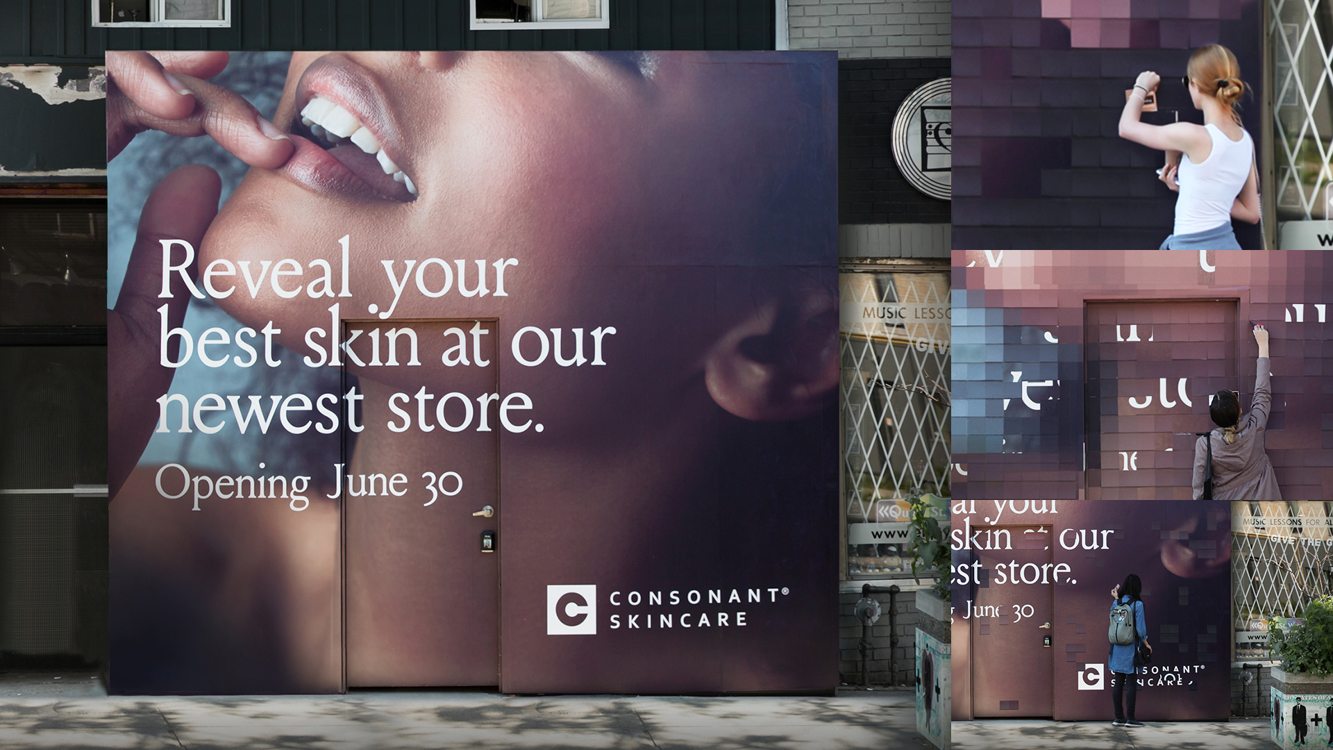
Re-Skinning Queen Street West
Consonant Skincare
Gold Design AOY: Zulu Alpha Kilo
Consonant Skincare
Re-Skinning Queen Street West
The Purpose
Should a skincare store in an area known for retail creativity try to stand out or blend in? Why not both? Consonant was created 10 years ago on the premise that to get great skin, you need to go more than skin deep. Its premium products are created with 100% natural and organic ingredients, but the company’s larger belief is that your skin reflects your overall wellbeing and lifestyle. The opening of its latest retail location, a Queen Street West concept store, put the brand at the heart of one of Canada’s most vibrant retail environments. This flagship location was created to offer wellness seminars, yoga classes, and community events, along with the innovative product line, to help people achieve their very best skin. It is a significant milestone for the brand, and moving into the neighbourhood in a way that sent all the right signals mattered to a community-oriented company.
The Challenge
We’ve all been to shopping areas where you hardly know if you’re in Montreal or Milan, places where global retailers appear in unvarying unison, completely lacking local character. No one is going to mistake Queen West for one of those areas. Fashion-forward labels and local designers have moved in, but more importantly, quirky shops and grungy outposts remain, creating a mix recognized by Vogue magazine as one of the coolest neighborhoods in the world. Along with all the usual challenges of launching a flagship location, the agency was tasked to establish a place in this eclectic, artistic environment by demonstrating a level of creativity that would earn the attention of local shoppers for both its originality and its street cred.
The Insight
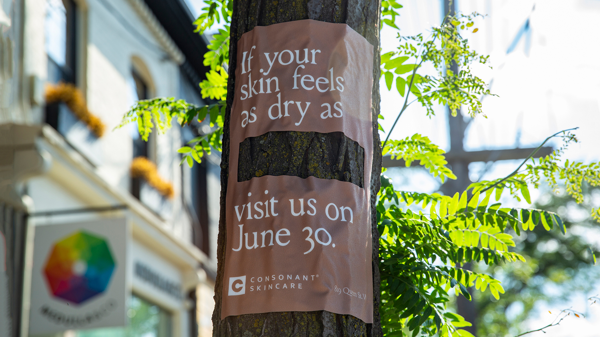
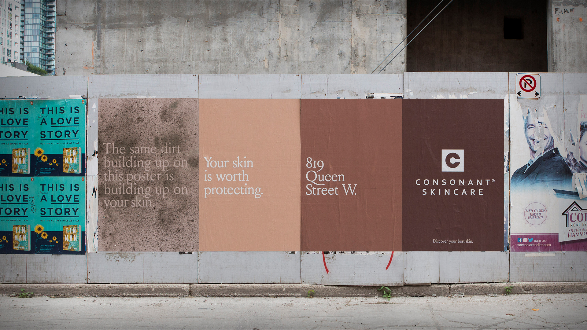
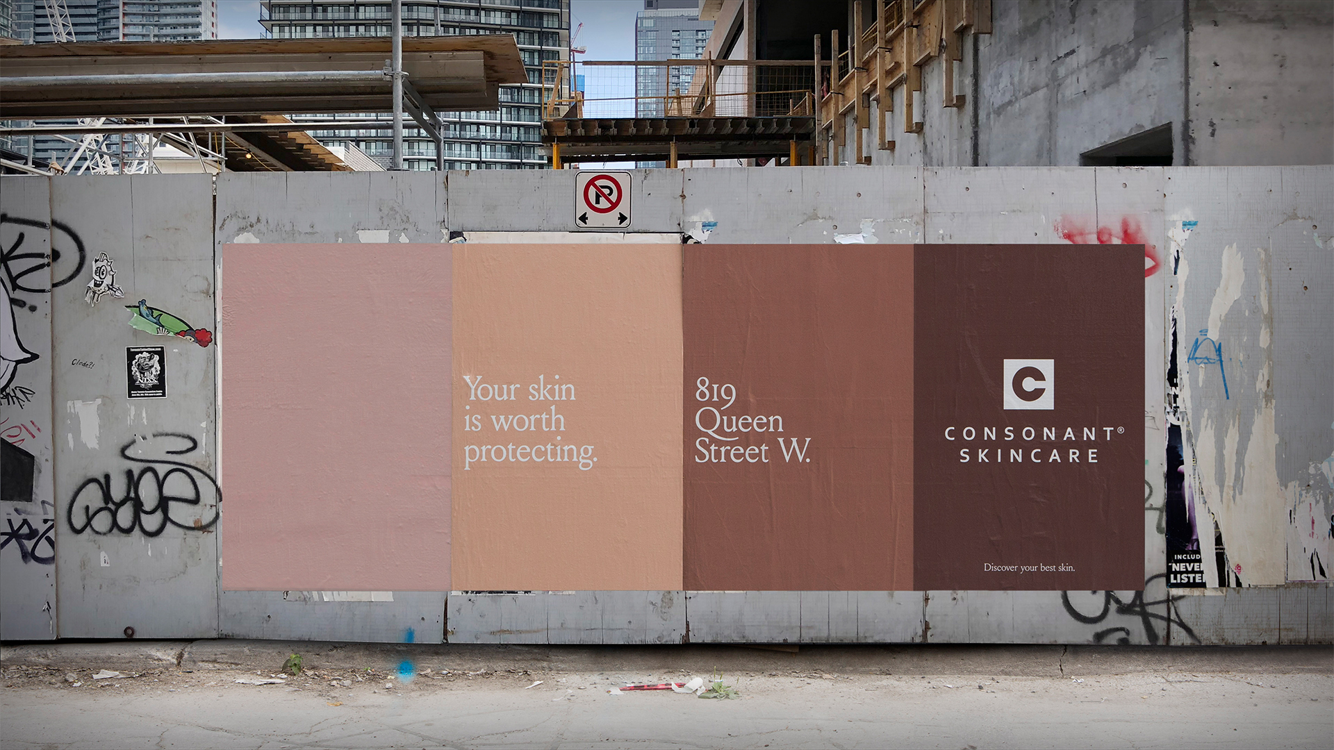
The default image in the skin care category is a picture of a pretty face with pretty skin, an approach that’s too simplistic for the brand and its new neighbourhood. The team looked for inspiration not in the skincare category but rather in Consonant’s new environment, and that’s where the agency found its insight: the many surface textures of the real world reflect the textures of our skin.
A short stroll along Queen Street presents interesting sights, unusual characters, and to the attentive eye, some very intriguing textures. These textures were far more interesting than the bland images dominating the beauty and skin care category, and were beautiful in their own right. They were also a great way to speak to the skincare needs Consonant’s products address. For a company that looks at things a bit differently, it was the perfect metaphor.
The Execution
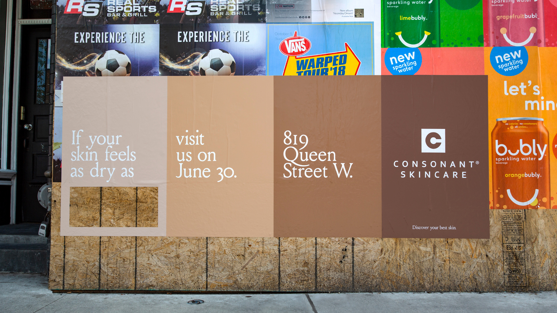
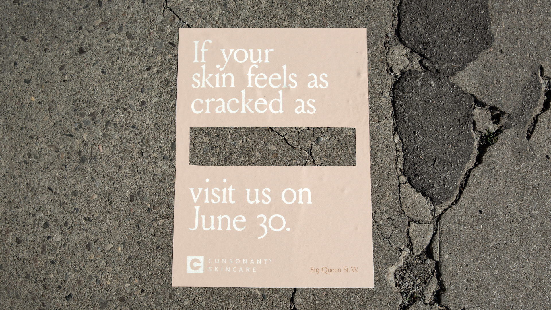
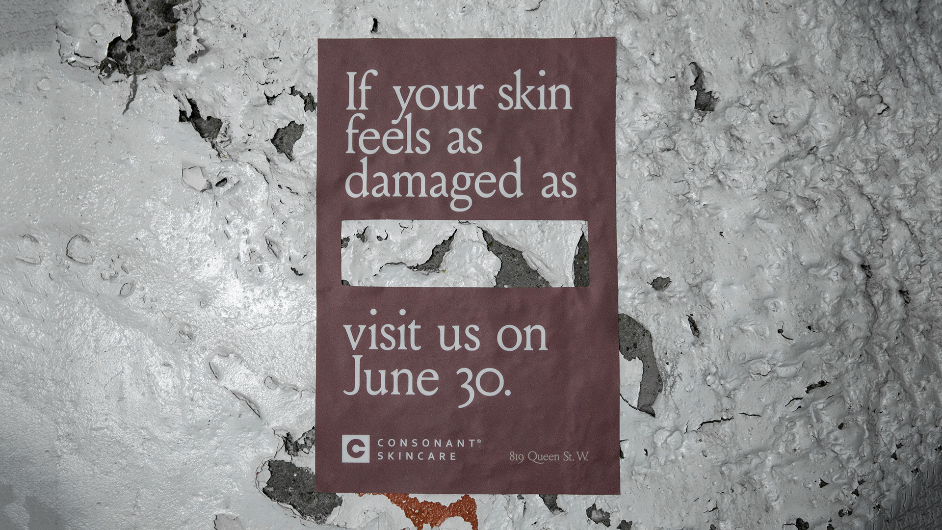
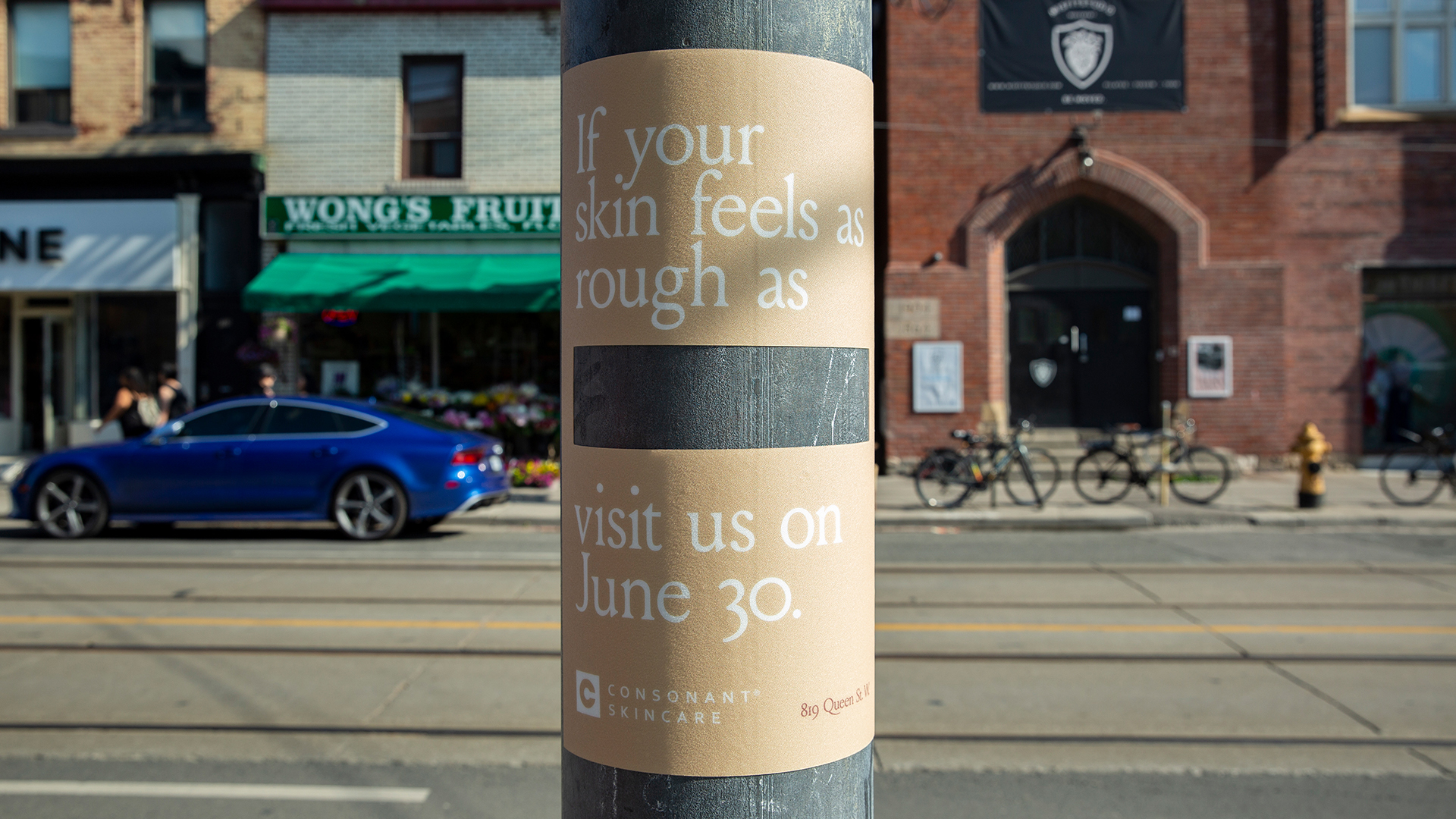
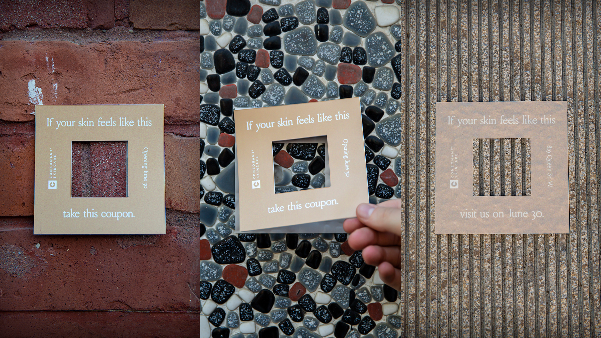
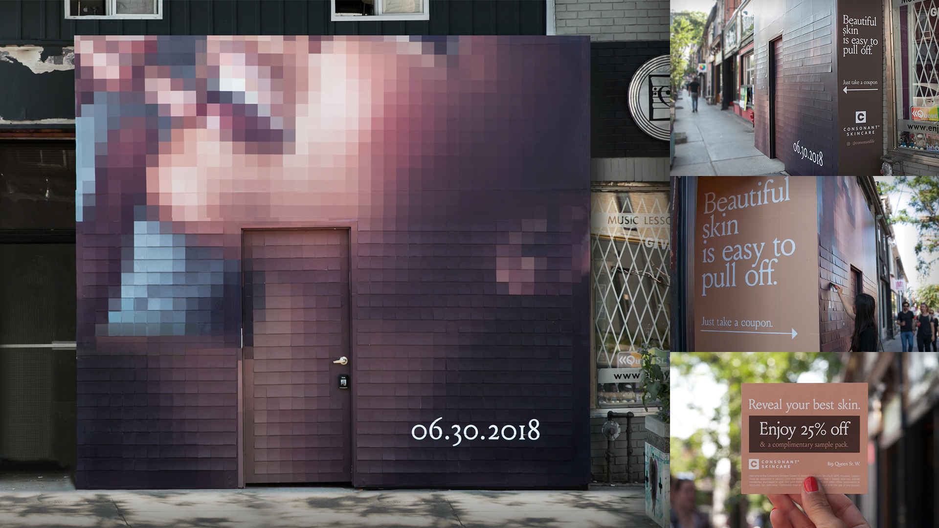
Consonant’s neighbourhood debut highlighted the beautiful imperfections and textures of the area itself. Ambient executions applied to walls, sidewalks and lamp posts featured exposed areas of local textures – including concrete, brick, plywood and stones – with the caption “If your skin feels like this, visit us on Jun. 30.” Simple 4" x 4" die-cut executions were posted on walls as take-one invitations/coupons.
The store’s hoarding was an enormous installation, which from a distance appeared to show a woman’s face, but closer up revealed itself to be a multi-layered application of 700 take-one coupons with pixelated images.
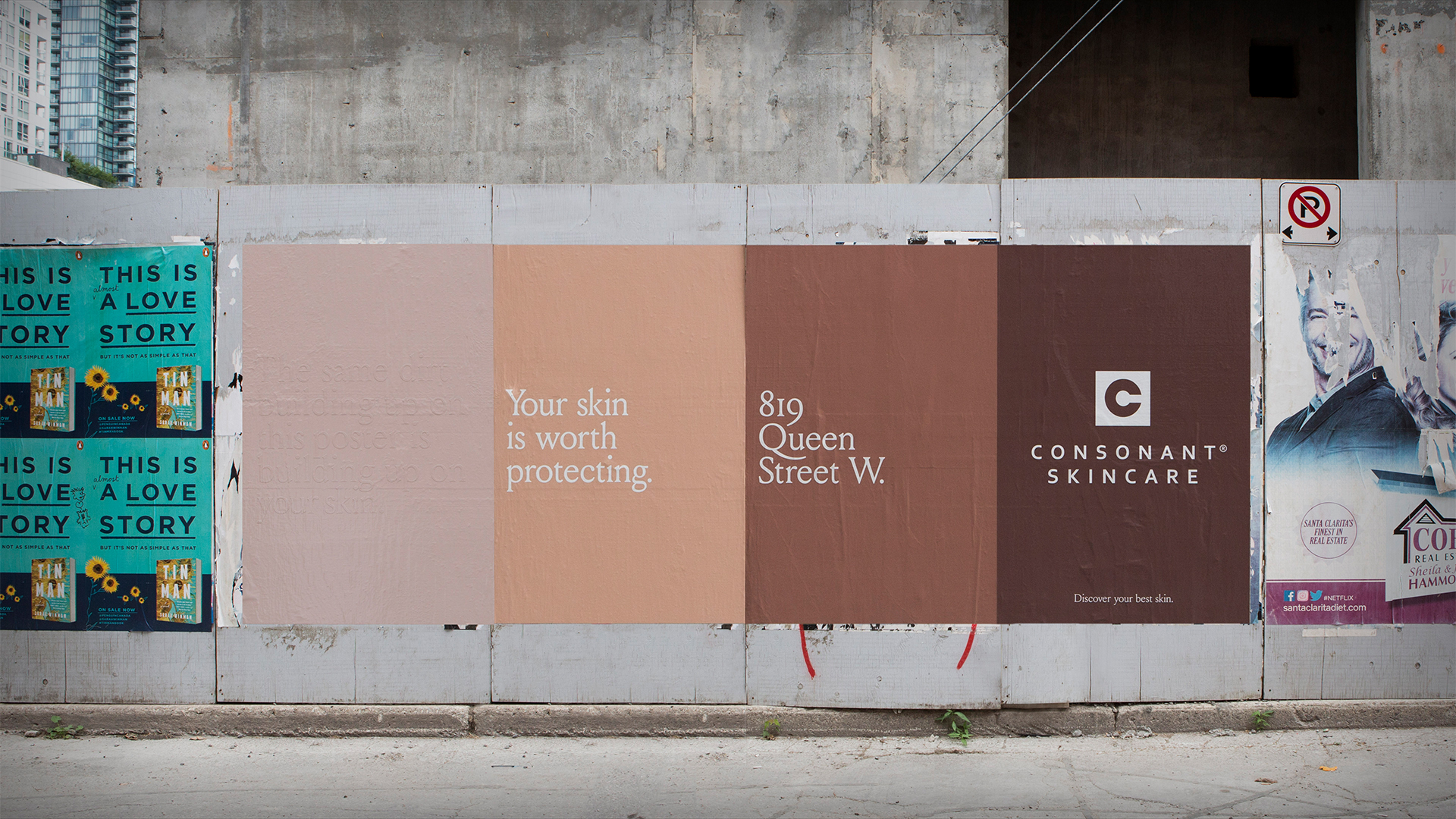
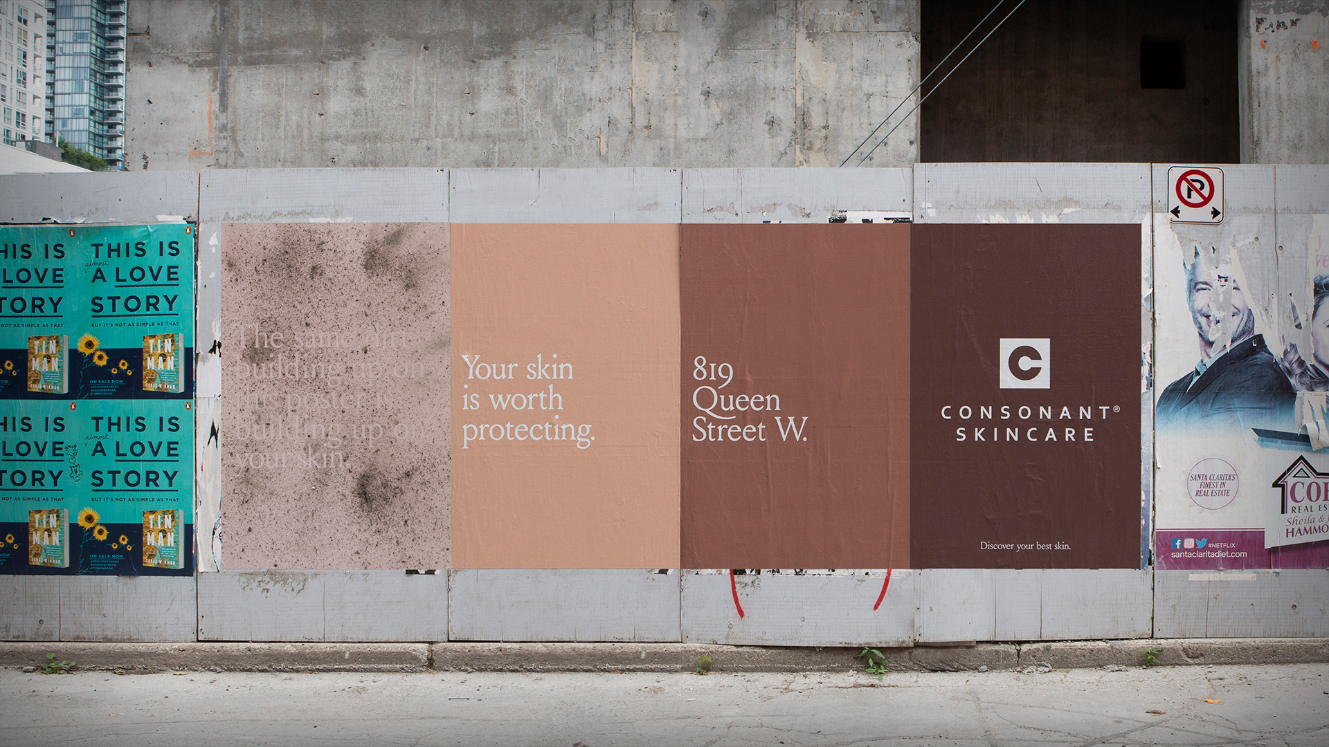
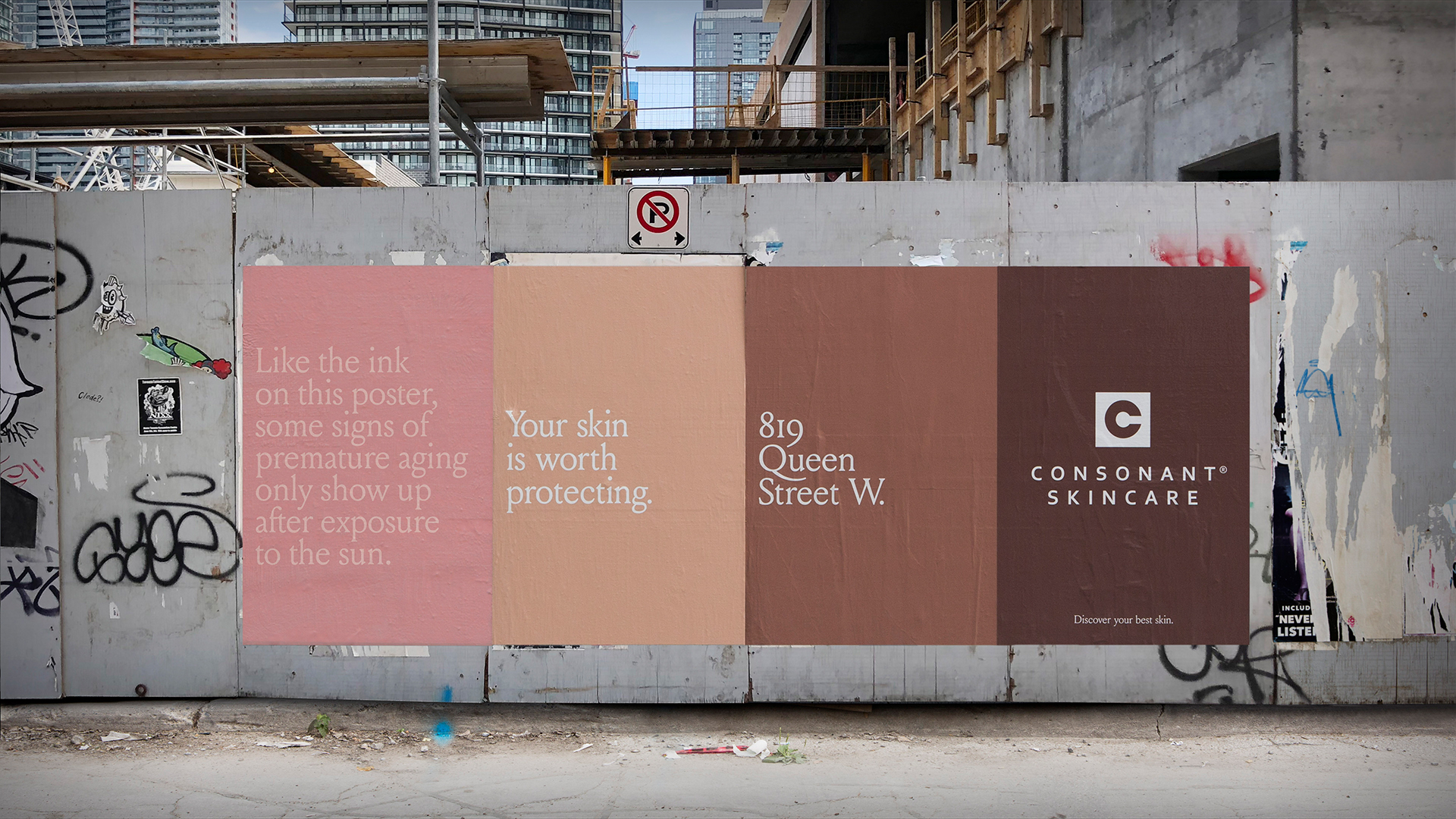
Ambitious poster ideas required a lot more than simple printing. Posters were developed with a sticky adhesive coating to capture and display the dirt and grime that can build up on your skin after a day in the city. A second execution featured UV sensitive ink. The line, “Like the ink on this poster, some signs of premature aging only show up after exposure to the sun,” was revealed only by direct sunlight. The agency also wanted to celebrate the beautiful and diverse skin tones of the neighborhood, so it crafted a colour palette to reflect that. Across all the elements, the use of different textures to represent different types of skin challenges made a statement about Consonant’s unique point of view and differentiated it in a category associated with very generic imagery.
The Impact
Through communications as organic and natural as Consonant’s products, the flagship store has captured the spirit of its new home. Markers of the successful launch were opening-day line-ups,
100% higher-than-average transactions, double the expected coupon redemptions (95% from new customers) and a higher non-sale opening-day sales than two previous store openings. The work even received a full feature in Communication Arts and other industry publications.