2018 Winner
Harley-Davidson Office Design
Harley-Davidson Canada
Gold Design AOY: Zulu Alpha Kilo
Harley-Davidson Canada
Harley-Davidson Office Design
The Purpose
At first glance, the words “Harley Davidson” and “office” may not look like they belong in the same sentence. Taking a brand that’s built on the spirit of the open road and capturing it inside corporate walls is a unique and challenging task.
Following the work Zulu Alpha Kilo had done with the brand in summer 2016 to open a Harley-Davidson café in downtown Toronto, it was asked to develop the graphic design elements for a new Canadian head office that was about to open north of the city in Vaughan. In addition to putting the brand on display in a compelling way, the company wanted the space to create pride for employees and to foster the camaraderie of time on the road among the head office team.
The Challenge
As with any company building a new office, there was a requirement to create a highly functional work environment for the employees who would call it home every day. With a brand like Harley Davidson, globally renowned for its design, the challenge was bigger than that. Beyond functionality, there was an equally important need to create a brand story in the head office space that would inspire employees, visitors and vendors alike, and help everyone who came into the environment to be immersed in one of the world’s most distinctive brands.
Two additional considerations added complexity to the challenge. Firstly, how do you do justice to a century of iconic design in a way that doesn’t simply turn into a brand museum or a glorified showroom? And secondly, how do you do it in a way that respects all that the brand stands for but feels distinctly Canadian?
The Insight
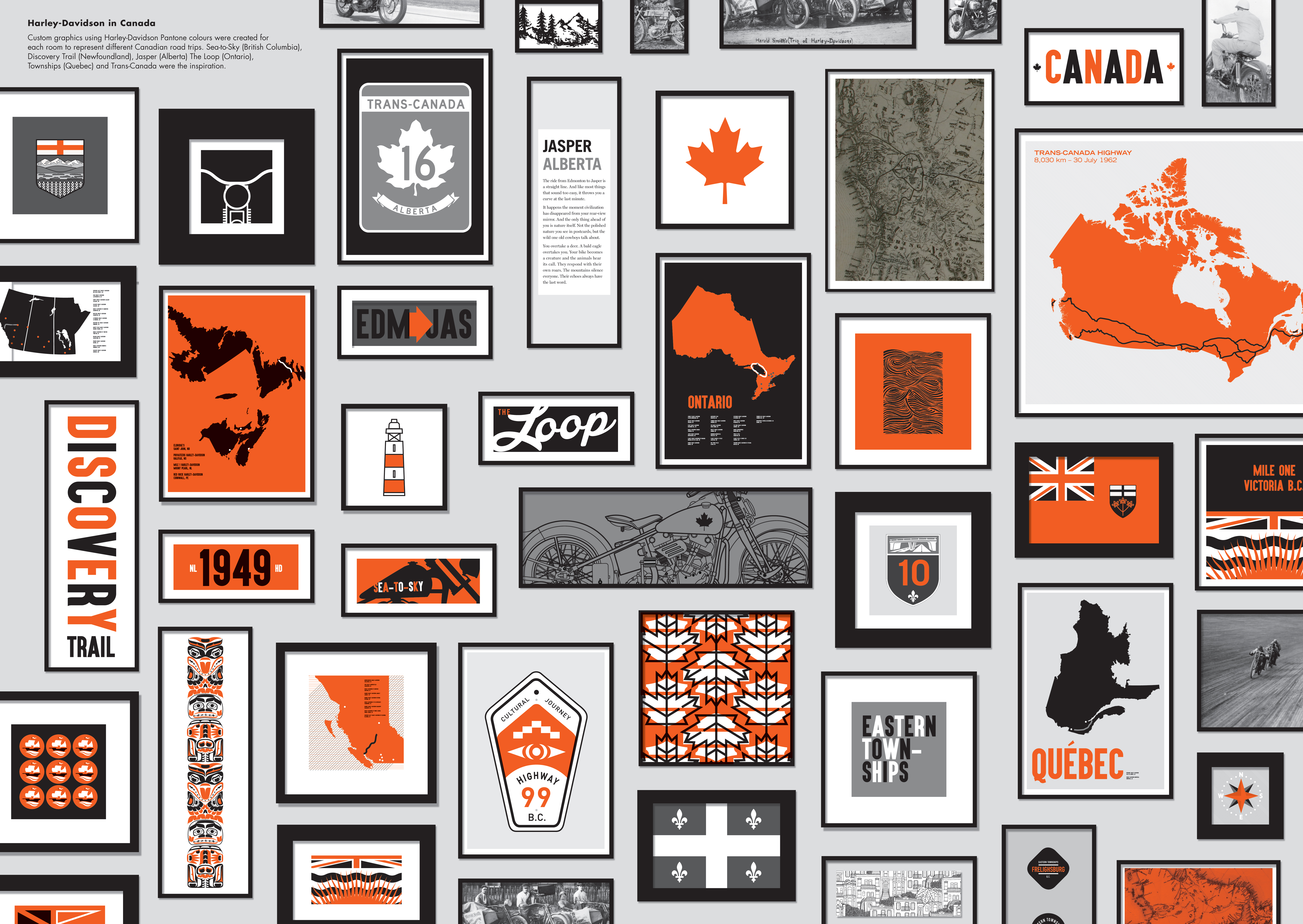
Like many global icons, the rigorous consistency of the way Harley-Davidson presents itself has helped to build the brand’s essence and create its legendary status. Even so, as the brand is found all over the globe, people experience it through their cultures and backdrops, adding a local layer of meaning that is unique to each region or country. That is especially true in Canada, which has some of the most epic landscapes on the planet for riders to seek personal freedom and experience the joys of the open road. Due to the richness of the Canadian experience of Harley-Davidson, the agency was telling the story of more than just one icon. Just as Harley-Davidson is an iconic motorcycle, Canada has its own iconic rides.
The Plan
The story the agency told brought those two worlds together. Since first impressions matter, the wall treatment of the lobby was dominated by wooden slats to evoke the shed in Wisconsin where William Harley and Arthur Davidson rolled up their sleeves and created a legend.
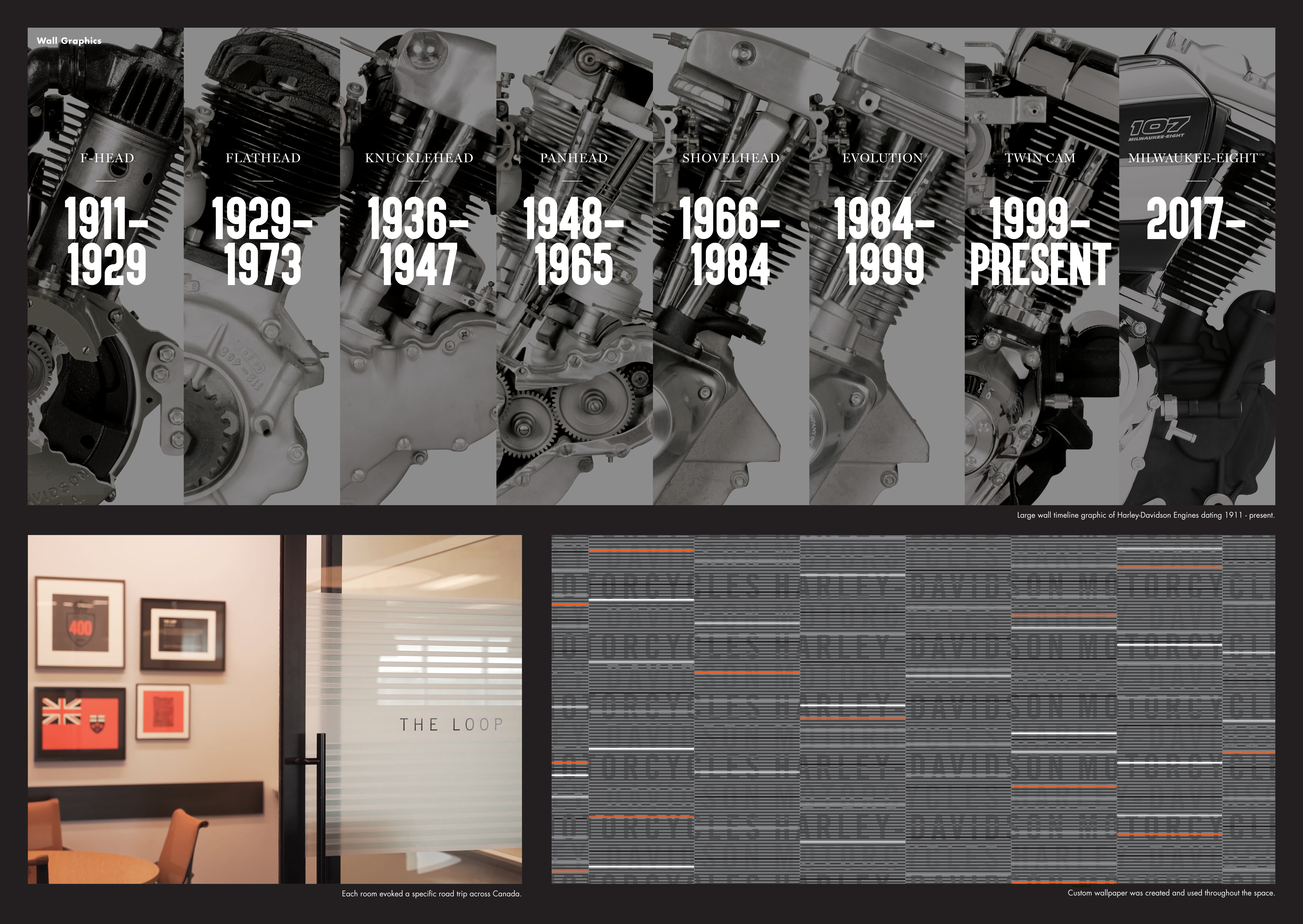
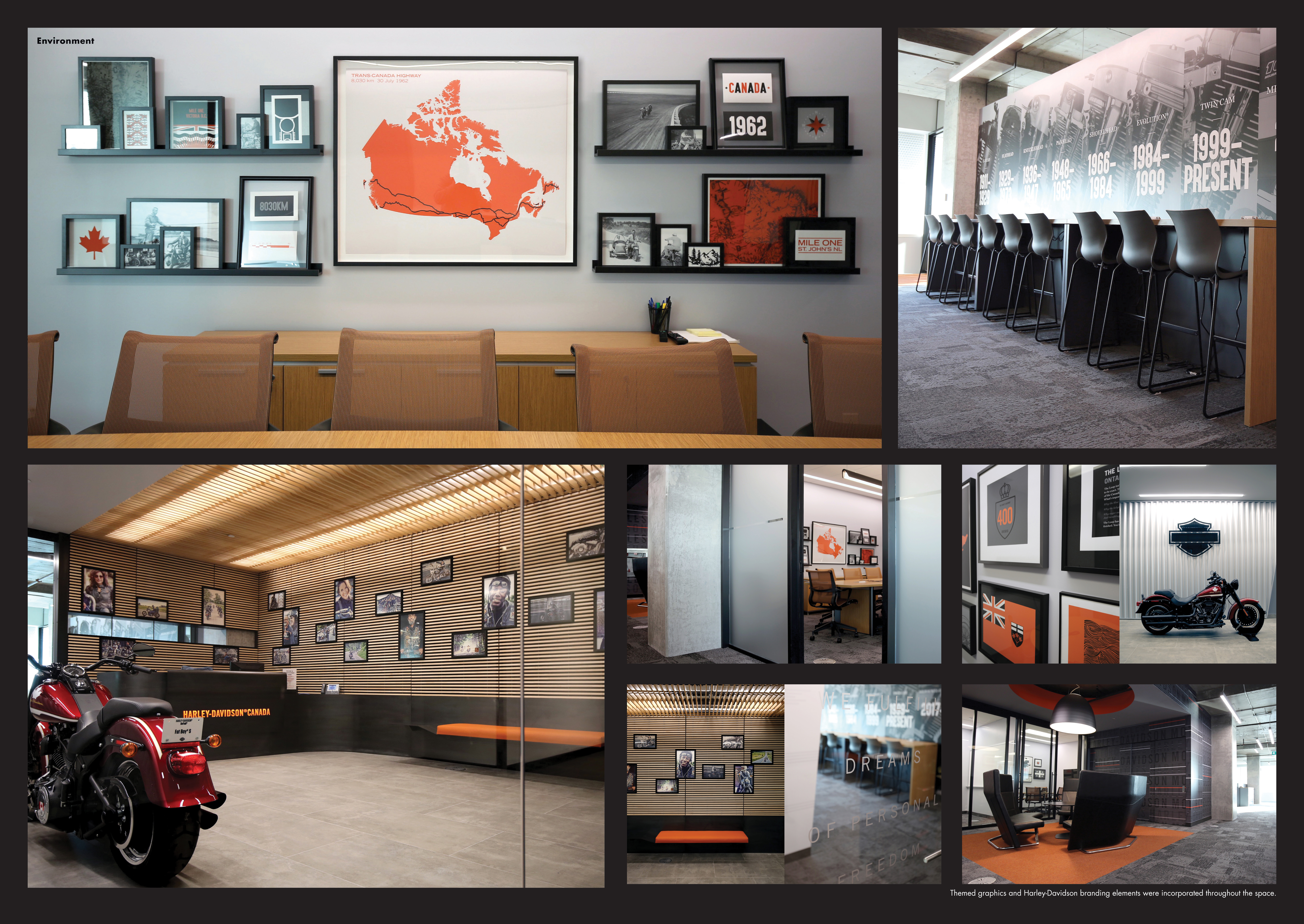
Moving through the office, and getting down to work, each of the meeting rooms was inspired by a unique Canadian ride. The main boardroom evoked the Trans-Canada Highway, while smaller meeting rooms were dedicated to regional rides such as B.C.’s Sea to Sky Highway or the Georgian Bay Loop. In each space, photography done by Harley-Davidson owner groups brought each region to life, and collectively, they told the story of Canada through the rides that Harley owners dream about.
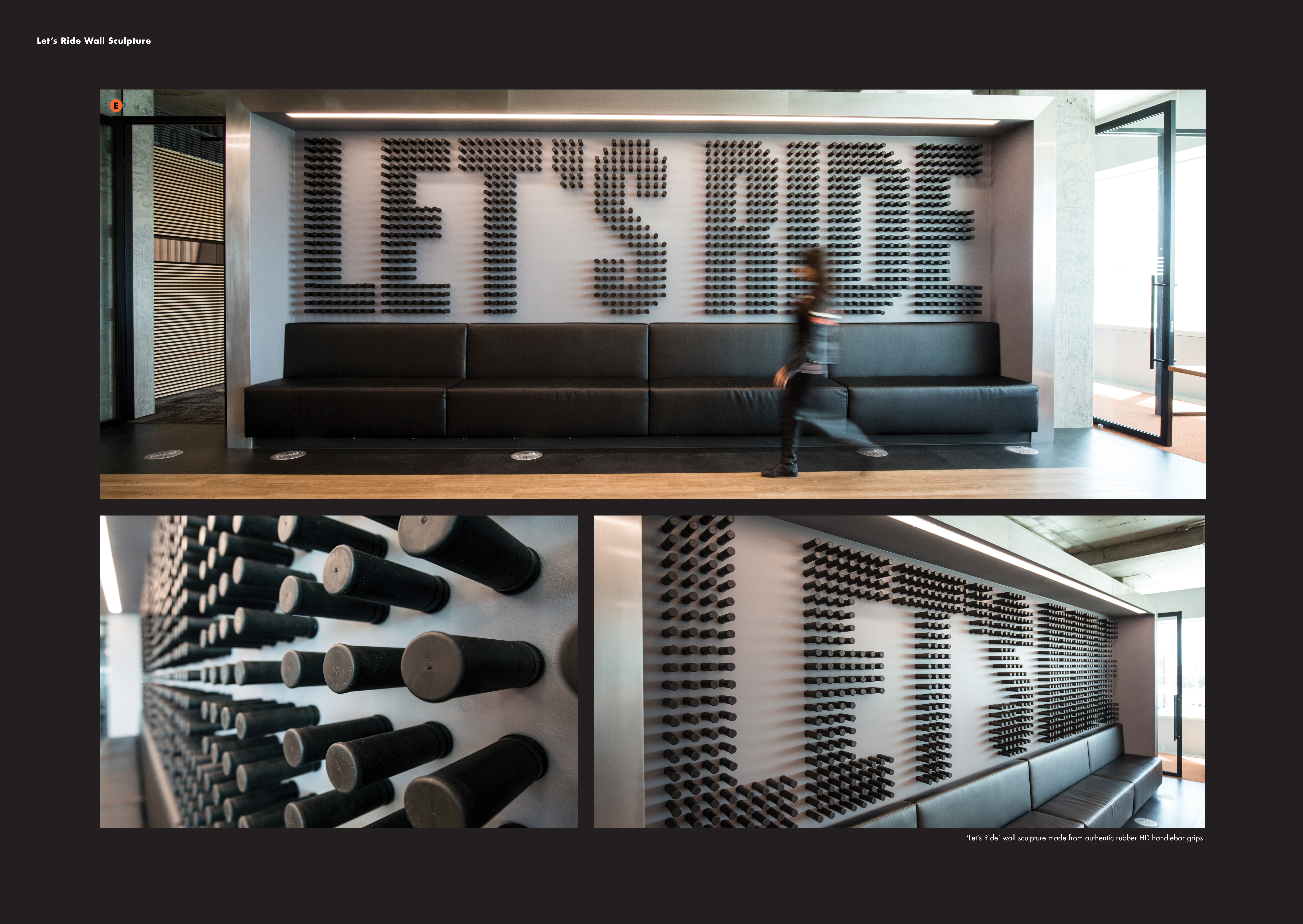
The tone of the office café is set by a large custom wall sculpture that reads, “Let’s Ride”, made from 1,100 Harley-Davidson hand grips. Common spaces put the cues and symbols of the brand on display in a larger-than-life fashion. Black leather seating is found throughout the office, while a feature wall of the most legendary engines over the decades provides inspiration in a large working space.
The Impact
Throughout the entire office space, meticulous attention to detail ensured that spaces create an impression that is entirely consistent with the brand’s boldness and free spirit yet encourages collaboration among employees. It has been featured on design sites globally and locally in Applied Arts, Stimulant and Strategy magazine. The graphic elements developed for the office struck the perfect balance between a century of a global icon’s legendary design and its local Canadian nuances.